Individual Tool Tips (Edit Guide) (QC Guide)
Introduction
It's impossible to teach every possible use of every tool offered by Photoshop, but hopefully this section will help introduce some of the possibilities not immediately obvious to the inexperienced editor. This section is still under construction, so I'll add to it as I have time.
The Brush
It's the brush, how hard can it be, right? Well, if you've ever tried to redraw a curved line without the help of a tablet, it may be harder than it seems. Getting the endpoints to match up, the curvature to line up, and the line thickness to blend in can be harder than it seems. The pen tool is handy, but fine tuning things like line thickness can be tough. So what's an editor not blessed with steady hands to do?
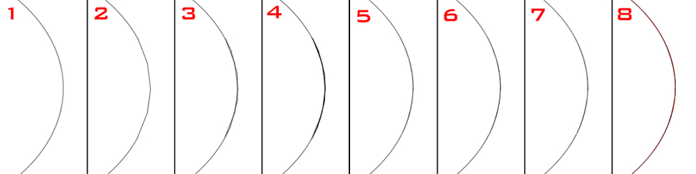
Instead of using bezeir curves or doing things freehand, you can do what is analagous to a reimann approximation of a curve. The original curve is shown in 1. A section was erased, then redrawn using an exaggerated example of shift+clicked straight lines (generally more, shorter lines would be used for a less jagged appearance) as shown in 2. In 3, more straight lines are drawn alternating endpoints from the original. Even more in 4. As the new area is significantly thicker now, we begin to trim off corners with an eraser, as seen in 5. In 6, the curve was sharpened to match the original lines (you may need to sharpen or blur, as well as burn or dodge, depending on the thickness and crispness of the original lines). In 7, a few more bits were trimmed off, and the final curve is shown in 8, with the original curve overlaid in red. Note how close the redrawn black line approximates the original red. Fewer steps are needed with practice, and thicker lines allow for more leeway.
Back to Top
The Dodge Tool
Say you're editing a page with bleed lines, perhaps from frame edges on the underlying page. Say the art in question would be somewhat tedious to clone, perhaps due to some awkward texture, or simply the amount of detail involved. A quick way to clean this up is with the dodge tool.
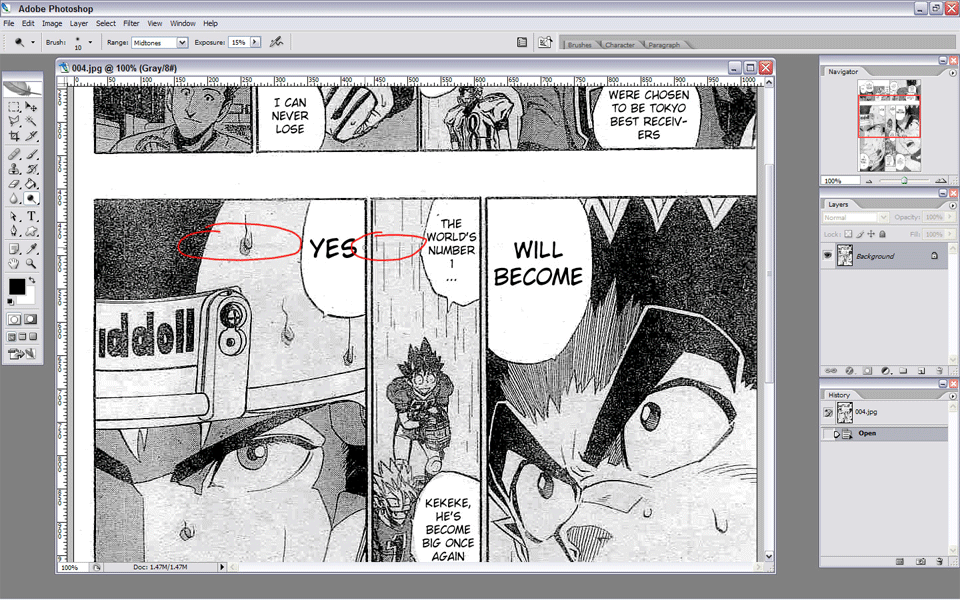
Choose a brush diameter approximately equal to the thickness of the bleed line, or ever so slightly larger. Set the brush on 0% hardness, a fairly low exposure, and set it to midtones. Then, simply run the brush over the bleed line until it matches the surrounding art. Combine this with the previous brush tip for curved lines, and for horizontal or vertical ones, just hold shift and wave the cursor side to side (or up and down). The sample picture here would probably be more easily corrected with cloning, but I didn't have raws handy, so I had to borrow someone's scanslation.
Back to Top
Quick Mask
Oh, quick mask, sometimes your best friend, sometimes your worst enemy. I assume we all know the basics - making selections, entering quick mask, and modifying those with the brush or eraser. But let's say you're trying to replace a screentone, you did the usual, but when you apply your pattern fill, there's a bit of noise and roughness. What may have happened is, your selection may have partially included certain pixels that you didn't notice.

Here's a magic wand quick mask that looks fairly clean. But imagine it wasn't (which is, in fact, the case). How could you check, and fix it?
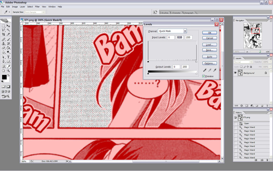
As it turns out, you can use the levels dialogue in quickmask mode. As with normal speck detection, adjust the middle slider until you see the specks.

Level until the specks are gone. Don't forget to reset the middle slider when you're done. Congratulations, you now have a clean selection. One side effect of this process, however, is that your selection's edges may be altered - remember to expand or contract the cleaned selection if necessary.
Back to Top
Quick Mask 2
So what else can you do with quick mask? As it turns out, a lot, more than I can cover on this page. But let's say you want to retexture an area, but one edge has art that, for whatever reason, cannot be reasonably reconstructed or isolated. Perhaps the region transitions irregularly into a swirl or gradient. Or maybe you want to blend two images, with a gradient transparency. One rather imprecise way is to use a large diameter eraser at 0% hardness and use the softness of the cursor to produce the transition. Another way is with quick mask.
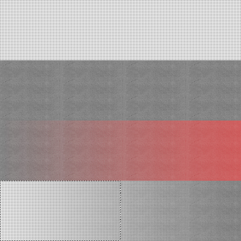
On top, a region has been filled by a grid pattern. Directly below, on a second layer, a gray screentone has been used. To create a transition between the two screentones, enter quick mask mode. Select the Gradient Fill tool, choose the basic black-to-white gradient, and create a gradient across the length of the image. You should see something similar to the third row. Exit quick mask, and press delete. You should end up with the bottom row.
What happened is, by creating a gradient in quick mask mode, you created a gradient selection, in which one end of the gradient was 100% selected, and the other end 0% selected. When you exit quick mask, and press delete, then one end was 100% deleted, thereby revealing the underlying layer. The other end was 0% deleted, preserving the top layer. Another way to create this effect would simply have been to enter quick mask and create the gradient selection before filling the second layer, then using the pattern fill within the gradient selection.
Not only can you use gradients in quick mask mode, but you can also use filters like blurs, renders, or whatever else may suit your needs, to adjust existing selections or create new and complex ones. These more complex selections may come in handy when you want to level or apply filters to one region, but have the filter's effects transition smoothly into unfiltered regions.
Back to Top
Opentype Features
Photoshop also has the ability to make full use of features built into opentype fonts. In the following example, the font in use is Bickham Script.

The menu can be found by selecting the character window, pressing the (>) button to the right of the word "Character", then selecting the context menu "Opentype". As you can see, this font includes several opentype features.
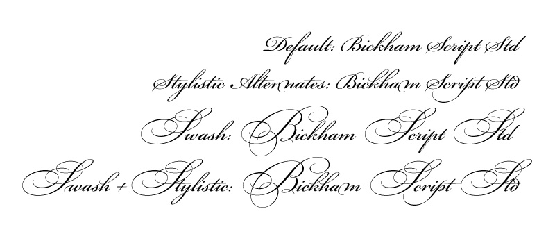
The first row of text is with none of the opentype features selected; the text reads: "Default: Bickham Script Std". The second row is with stylistic alternates selected, and reads: "Stylistic Alternates: Bickham Script Std". Note the differences in the various characters, most notably 'm' and 'p'. In the third row, swash has been selected, resulting in the use of swash majuscules: "Swash: Bickham Script Std". Finally, on the fourth row, both swash and stylistic alternates have been selected. The line reads: "Swash + Stylistic: Bickham Script Std".
You can apply these features to individual characters rather than entire lines if needed. Simply highlight the character or characters, and activate whichever feature you prefer. Of course, not all fonts have opentype features, and some have more than others.
Back to Top
Ruler Rotation
One of the most annoying first steps of joining a 2pg spread is lining up the two pages. Rather than just transforming the pages and trying to align them manually, if there's a line that spans the gap, i.e. a frame margin, you can simplify things greatly.
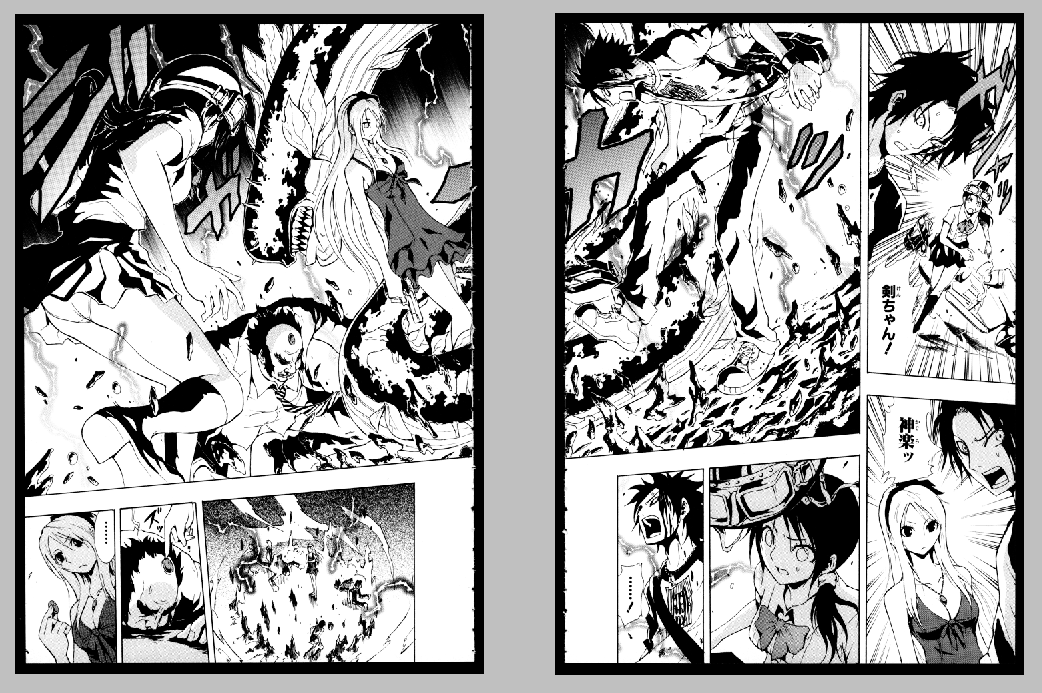
Here we see the original two pages to be joined. Unfortunately, a quick glance will tell you that the two pages need to be rotated different amounts. Fortunately, there's a more mathematical way to do this.
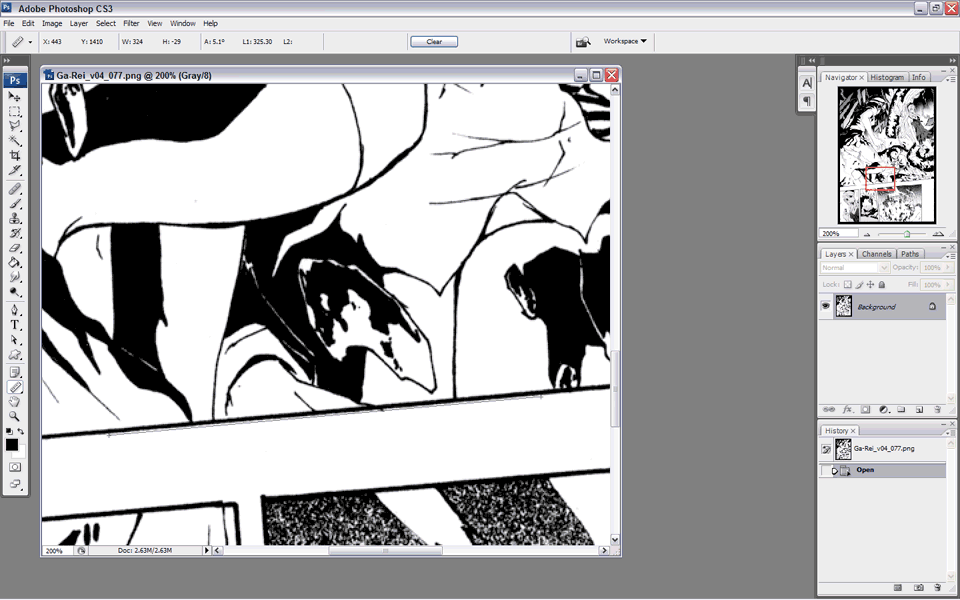
Now, for those of you familiar with the ruler method for rotating pages, this is one situation where the ruler comes in handy. First, select the ruler tool, directly above the hand tool; it's an alternate to the eyedropper tool. Now, click alongside your guide line, in this case the frame margin, and drag a ruler line parallel to it. Then click Image>Rotate Canvas>Arbitrary, and the numerical value needed to rotate that ruler line until it's level should automatically be in the box. Click OK, and the image should be rotated, with the canvas size expanding as necessary. Repeat with the other page.
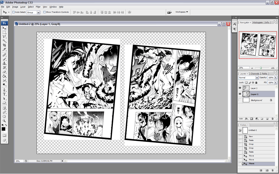
As it turns out, in the above example, one page needed rotation of 5.11 degrees clockwise, while the other needed 5.0 degrees. In any case, now that you have both pages at the same, albeit diagonal, angle, it's time to line up the pages. Select the upper layer, and turn its opacity down to 50%. Now, move it over the lower layer until your guide line is sharpest, indicating that the pages are lined up properly. Return the opacity to 100% and erase any extras in the center. Now, hold Shift to lock movement, then slide the page horizontally until you find the appropriate distance to best align the rest of the art. Commence redrawing.
Back to Top
Row/Column Marquee
So I'm sure you've seen plenty of fun zoom lines that need redrawing. In some cases, it may be easier to just manually redraw the lines, or in other cases, simply copy, paste, and rotate. However, in some situations, this little trick may come in handy. I didn't have a good example on hand, so I fabricated one to demonstrate.

Start with one of the line marquee tools, either horizontal or vertical as the situation demands. In this example, I will use the horizontal one. This basically selects a horizontal line a pixel thick, all the way across the page. First, select a line above the SFX to be removed. Hit copy, paste, and free transform to drag the line down into a rectangle. Now, turn the opacity down to about 50%, then select Edit>Transform>Perspective. Drag one of the lower corners horizontally inwards until the new lines match the remnants of the old. Depending on the zoom lines, you may also need to adjust the lower middle box to one side to line up all the lines. Now, return the opacity to 100%, and erase what you don't need. As you approach the SFX, you may want to switch to a 0% hardness eraser to get a more gradual blending of the two layers. It may also help to use the dodge highlights tool.
Obviously, for situations where you want to use the vertical marquee, the same steps apply, only the direction you transform the pixels will be different.
Back to Top