Intro to Typesetting
Phew. I’ve been meaning to do this for over a year now >_>
Typesetting is an extremely important part of editing manga because one of the things readers focus on most is the text. It doesn’t matter how good your cleans are if your typeset is horrible (and vice versa). Likewise, a good script is important too. Don’t be afraid to ask the translator if it’s all right for you to do some minor editing while you do the typesetting. Oftentimes, translators focus too much on individual words and not enough on the flow of text on the page. Consider typesetting to be the bridge between cleaning and translating.
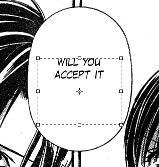
1. Entering text. Choose the Text tool in PS (or hit T). Your cursor now looks like a typical word processing cursor. Click and drag to make a square roughly in the center of your bubble. Your text will now be limited to the interior of that square, and you can type or paste your text. The other option is to just click once and start typing, but I’ve found the auto-wrapping in the text box to be convenient and sometimes pleasantly surprising.
[spoiler]
[/spoiler]
2. Choose an appropriate font. Visit this page for info about choosing your fonts.
3. Choose an appropriate font size. You don’t want your text crowding the bubble, but you also don’t want to make people squint to read it. Also be careful that text in adjacent bubbles don’t smoosh together.
[spoiler]
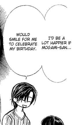
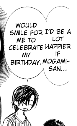
Obviously, the second example is TOO BIG!!
[/spoiler]
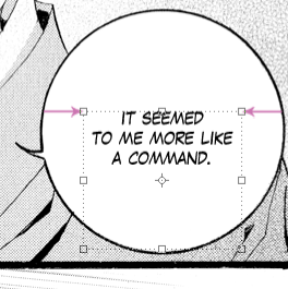
4. Center your text. This may seem like a no brainer, but you’d be surprised. With the Text tool selected, you can hold down the CTRL key and click and drag your text. Alternatively, you can select the Move tool (or hit V) and use your arrow keys to nudge the text box around. What I like to do is make sure the corners of my text box are the same distance from the bubble on either side.
[spoiler]
[/spoiler]
5. Fix the shape of your text. Lots of people talk about making your text a diamond shape, but keep in mind that there are times when other elements may be more important than the shape of the text. By “diamond”, we mean the lines of text should be narrow at the top and bottom and wide in the middle. What you don’t want is uneven line lengths. Photoshop automatically wraps your text within the text box, and more often thant not, you will have to use the return key to push your words around to find the best shape for your text.
[spoiler]
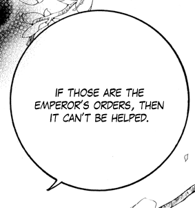
This example isn’t a diamond in the strict sense of the shape, but the lines are narrower at the top and bottom and wider in the middle. It matches the shape of the bubble nicely.
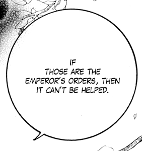
Be careful you don’t obsess too much about the diamond shape and make the top or bottom line too narrow. It doesn’t literally have to be a diamond. It just needs a nice “round” shape.
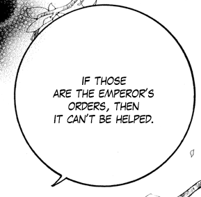
This is what I meant by having uneven lines. Sometimes, it’s unavoidable, but do your best to get a nice block of text.
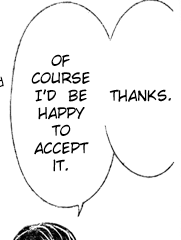
Here’s an example of where an ugly block of text is necessary. If I made the left text box wider to accommodate a better shape, it would mush into the “Thanks” in the right text box.
[/spoiler]
6. Be careful with hyphens. Some typesetters like to hyphenate words in order to get the perfect diamond block of text. Some typesetters absolutely hate to hyphenate a word unless there’s no other choice. I prefer to use hyphens sparingly, but whatever you decide to do, try to put the hyphen in the center of the word and not near the beginning or the end. Also make sure there are no leftover letters spilling into the next line, and DO NOT hyphenate one-syllable words.
[spoiler]
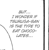
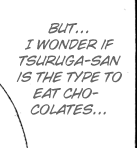
Choco-lates looks much better than Cho-colates.
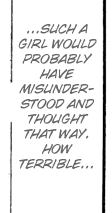
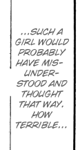
Also, try your best not to hyphenate a word more than once. In the second example, you have one word spanning three lines.
[/spoiler]
7. Aim for consistency. Don’t just throw your italics or bolds around at random. Try to match the text on the raw. Lots of people save italics for thoughts or make the text gray instead of black, and bold+italics is usually used for shouting. Whatever you choose, stick with it!
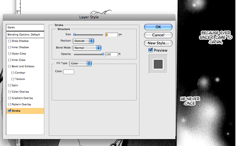
8. Stroke text that’s not on a white background. Black text on a gray background can be difficult to read. Black text on a pattern can be an eyesore, so what we need to do is outline the text in white. After you type out of your text, right click on that layer and choose Blending Options. Click on Stroke. From here, you can choose the color of the outline (usually white), the pixel width of the outline (3 px is usually good), and other settings (make sure it’s set to Outside).
[spoiler]
[/spoiler]
I vaguely remember someone asking about stroking text using GIMP. I came across this tutorial the other day and thought it did the trick simply and quickly: Gimpology
This looks like a pretty good Gimp site in general.
Other miscellaneous pointers:
- Try not to use vertical text. It’s just too hard to read. Keep it for the SFX.
- Use punctuation!! As much as you’re probably sick about people harping on you about grammar and punctuation, it really does make a huge difference in the overall quality of the typeset. Even if the Japanese text doesn’t have any punctuation, you could always add an ellipse (…) to show that the sentence is continuing in another bubble.
- Go easy on the warped text for SFX. All too often, it warps into illegibility.
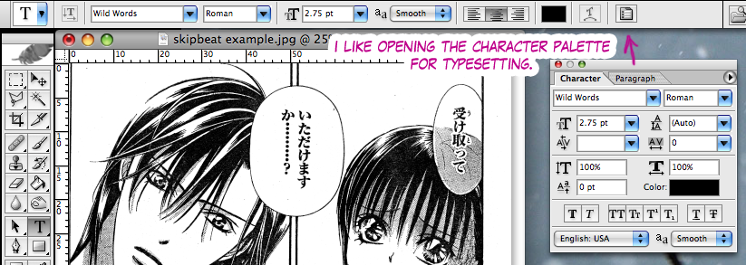
- The Character palette is pretty straight forward, and if you hover your mouse over a button, the name will pop up. One thing to point out is the anti-aliasing (aa), which you want to keep on Smooth (sometimes Strong is good for shouting, though you can get the same effect from other things like bold or italics).
- I also recommend creating a Layer set (folder) and putting all your typeset layers in there. It often comes in handy down the road, and it keeps your Layers window from getting cluttered.
- Sometimes it can be tempting to just use the Move tool to mush a block of text into an ill-fitting bubble. However, don’t change the text height or width more than ~10%. If you stretch it any more than that, it really stands out from the rest of the text on the page and just plain looks bad.
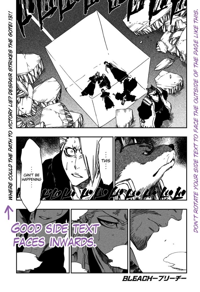
- If you rotate your text so that it’s running vertically, make sure the bottom is oriented towards the center of the page. [spoiler]
 [/spoiler]
Thank you very much for the nice tutorial. I’ve been struggling with those texts for some time and it’s just nice to get more and more information on how to manage those texts better. Besides, like it or not, words are just far too important to be ignored ^^
Glad the tutorial helped! Feel free to post any questions you have here ;)
[…] Now that you have your fonts, check out the Intro to Typesetting! […]
I really love this guide. It pretty much covers everything that`s needed to be a typesetter, in my opinion. Without this guide, I don’t think I would’ve made it into my scanlation group.
I was wondering how to put some of an SFX text behind, say, a person’s head? I’m not very good in the technical department (Luckily, TSers don’t need a lot of tech. skills), so I was hoping for an answer from you. XD How to do it could be a good addition to this guide? … Or is that too advanced for an intro to typesetting guide?
Thank you for the guide!
Glad you’ve found it helpful ^_^
For SFX that get cut off, first make a duplicate layer and hide one of the copies. This is for safekeeping in case you make a mistake. For the layer that is still visible, right click on the layer and choose “Rasterize Layer.” Now you can treat it like normal and use the Eraser Tool. This is good if you need to add a filter or something like that, too.
What does SFX stand for? haha thanks for the tutorial.. I’m taking a typesetting job soon.
Sound Effects! Good luck with the typesetting ^_^
This is a beautifully written intro that covers everything that is essential to good typesetting- A brilliant website! Thanks for all your hard work… I love spending time reading the tutorials and plotting what to make the new editors read from this site XD
(And also imagining what you must look like when you’re editing… editor magician FTW!)
“Even if the Japanese text doesn’t have any punctuation, you could always add an ellipse (…) to show that the sentence is continuing in another bubble.”
How much is it true?
LOL wow 2 transcendence members in 9 comments XD. with me, that makes 3 >=D
Transcendence!! You guys are great! I love Nishikata Mai, so thanks for doing Sweet Black (^_^)d
*kicks Xye* =)
Aw, we love you, too, chiresakura-sama. Thank you for writing this guide.
Chiresakura-san what font do you use on this tutorial cc wild word and what’s the name of the other one?
The other font is Lafayette Comic Pro ;)
awesome guide! helped me a lot ^___^
can u please do a tutorial for cloning/redrawing too, I’m pretty bad at it. T^T
Sorry, this is as much as I’m going to cover cloning: http://senbonzakura.kageyoshi.net/2008/02/20/intro-to-the-clone-tool/
I still feel that complicated redraws aren’t worth the time (I once spent an hour on a giant SFX and then realized I’ll never have that hour of my life back), so basic cloning or pasting from a different part of the page can get you through most redraws.
i’ve been trying about the diamond shape on the text but i just donno how… :( please help! thank you
Sometimes, the text just doesn’t cooperate with the diamond shape no matter how you push the words around. Just make sure you try to have the lines of text narrow at the top and wider in the middle. And it’s more important to match the shape of the bubble (tall and thin? round?) than to go for a diamond ;)
when u mean pushing the words is it by using “space” or “tab” ? sorry i’m just a super beginner for typesetter as well as photoshop ><
I mean by using “return” or “enter”. So try adding a line break after a word and see how the whole bubble looks. If the middle got too small or the top and bottom got too wide, then delete the line break and try breaking up the words in a different place. Sometimes I’ll try a few different line breaks, then resize the bubble to make it wider or narrower, and then do more line breaks. Whatever it takes to make it look good! ;)
Thanks chire! you are superb!
What Photoshop version is this for?
I wrote this when I had CS, but I have CS5 now and pretty much everything still applies.
mmm GREAT TUTORIAL i am trying to stroke the text but cs3 don’t give me an option to change the color and just can stroke gray the image is in grayscale i am trying to set rgb to see what happens i see first sigh red gotta mess the chanels to see what happens and don’t give me the size option
i just write to say that i solved it again great tut
awesome :D
oh my gosh!! this is totally helpful and easy to understand!! thank you so much!! its a great tutorial ~!
[…] A awesome guide on typesetting, click here. […]
[…] A awesome guide on typesetting, click here. […]
[…] A awesome guide on typesetting, click here. […]
This really help a lot.
Thank you for the tutorial!
[…] a newbie in typesetting, other groups, like DP, ForeverMore (mainly sfx), RedHawk , and Senbonzakura, have provided tutorials on them already. Head over those links to learn more about the art of […]
[…] If you’re a newbie in typesetting, other groups, like DP, ForeverMore (mainly sfx), RedHawk , and Senbonzakura, have provided tutorials on them already. Head over those links to learn more about the art of […]