Hello, anime and photoshop fans! First of all, I would like to state that many tips in this guide might be appliable to other image editing software, and they also work on images other than anime ones.
If you're reading this, your probably one of us who has a collection of images in our hard drive, or archived away. Ever wondered why you have the images colleted? I didn't noticed that until I have two boxes full (now two CDs :) diskettes with images, that I'm starting to take collecting images as a hobby, and yes, we know which scans are good which scans are not, to filter out ones you don't like so your hard drive doesn't get stuffed. It's a hobby.
Some of us even go as far as to scan images that we like, to collect, or to share. Now if the images are for distribution, do others like your scans? After scanning pictures, do they feel like a copy from the origional that you've scanned? Surely you like your scans to be so good that you can place it in front of you everyday. This is the guide that can make all of your scans this good.
This guide will start from hardware, from choosing the right hardware to setting the right configurations. Then it moves on to enhancing scanned images, where an image downloaed from somewhere can be enhanced too. These are what version one of the guide covers, and version two is available in this HTML format (still under construction) and includes tips on applying images on web pages.
Photoshop Editing Guide, Table of Contents -
- What do I need for scanning?
- Scanning methods and tips
- Image enhancement (freshly scanned, 16M color, 24bit images)
- Advanced image enhancement and effects (Not included in this guide)
- creating or mixing backgrounds
- creating noise free images
- removing book bents and shadows
- adding letters and decorations
- adding real life images
- creating wall papers
- coloring black and white images
- automated editing using macros, with the Windows Recorder
1. What do I need for scanning?
| CPU | Memory | Video | Other | |
| IBM/PC | 486DX-33 | 12 MB | VLB, PCI 2MB | SCSI Connection |
| Macintosh | Quara, Performa, anything new | 8 MB | Thousands of color + |
- A faster CPU/disk drive can compensate for less RAM
- Spend money on RAM instead on accelerators
- Hand held scanners are a joke
- One pass flat bed scanners are good
- Though the ceapest one can often do
- Three pass scanners are annoying :)
- Always buy SCSI scanner, hard drive too
- The mouse stinks so does the ball and that funny pad
- Digitizer pad (larger than 5" X 5") is the god
- Digitizer pad with a stylus (pen) of course
- "Pen Mouse" is a very bad joke
- If you're plan to print, you need twice the power & RAM from above
- The screen is 72 DPI, printer prints at 300 DPI and above
2. Scanning methods and tips
Preparing images
Proper preparation saves your time and effort. Select a picture that won't kill too much time on your hands and here we go.
| Ideal scanning material: | Time consuming material: |
|
|
Call me the point form man, but it's better than 200 paragraphs. ^_^;
These factors improves the scanned material's quality, common sense.
- Large size
- Laminated surface (Illustration covers)
- Smooth paper quality (some are purposely textured too)
- High origional DPI (hard to see dots)
- Thick paper or no stuff underneath (no see-throughs)
- Vibrant colors
- Dark colors easily visible from black
- No text on the way
Avoid posters unless you have that poster size scanner, check your garage.
Imagine a cheap casette card which had been stepped on. Yuck.
Also, don't you notice that some pictures people's black hair with
others' all "glued" into one or to others' clothings because they're
all dark? That's one of the things I would concentrate to prevent.
 First thing's first, load up Photoshop, and now:
- Select File, Properties
- Select Pixel as units (Unless you're printing)
- Select swap drive, etc if not already done so
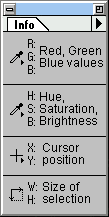
- Select Window, Palette, and show Info Window
- Select Info Options on the little arrow on the Info Window
- Now make it show HSB and RGB values
Before scanning, make a quick low resolution scan to make sure that black doens't have 0% Brightness in the info box and white doesn't have 100%. The reason so is because... look below:
| Example | 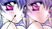 |
 |
| Problem: | If white is too bright, other light colors might be too bright too. |
Same thing for black, dark details will be missing if back is too dark. |
| To correct: | Decrease brightness on scanner or the scanning software. |
Decrease contrast. |
If you screw up this part, Photoshop can't fix values at 0 or 255. ^_^;
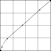 Another adjustment I recommend you to make is to first tune the curves in
your scanning software so the image will be easier to edit. Wow, I've even
got an example on the right so I don't have to spend half an hour
explanining. ^_^;;;
Another adjustment I recommend you to make is to first tune the curves in
your scanning software so the image will be easier to edit. Wow, I've even
got an example on the right so I don't have to spend half an hour
explanining. ^_^;;;
Selecting sizes and DPI
This part is actually pretty simple, just scan at the highest possible DPI that doesn't make your computer explode. ^_^ Say if you have 8 megs of RAM, try to scan no bigger than 10 megs, etc, so calling up a command doesn't so long that it puts you to sleep. Why as big as possible? (hey, insn't ABAP that a newsgroup?) Just because if you need to do any editing, the flaws won't show when the image is done, and that includes commands ranging from remove noise to sharpen.
Preventing background noises
"Dip the page in boiling water, them iron it at 120 degrees..."
- Mrs Betty.
Tried it, doesn't work. Let's do it my way.
When scanning any thin pages, image or words on the back usually gets scanned into your image too. To prevent that, place a black sheet of paper behind (not in front :) the page.
When the page has a page fold, try to extract the staples off the magazine then put it back afterwards, by the time you're an expert at this, it'll save you time with less editing to do. -_^
Dusts and insects often visit your scanner, clean them out often.
* Joking alot, must be my special sub (yuk) plus the can of Coke.
- IBM's (Ctrl) = The Apple (Command) key on a Mac
- IBM's (Alt) = (Control) key on a Mac
- If I say Image, Adjust, Levels, that means click Image on the pull down menu, then select the Adjust sub menu, and select the Levels command.
3. Image Enhancement
Here's where all the fun starts! Enjoy.
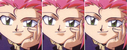
Some large images will appear due to the author's laziness to convert them to nice little ones. Sorry.
Correcting color disorientations
Kind of a useless tip, but check the image for faults before working on the image. First is to check to see if you missed scanning any part of the picture, then see if the picture's been moved during scanning, causing distortion. Some scanners just make distortion once in a while.
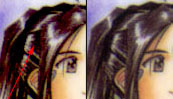
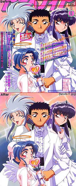
Check dark and light colors between different in quality paper. Then, enlarge the image and focus on places with high detail. A good choice to zoom at is a character's eye, now look for distortions. The example is below.
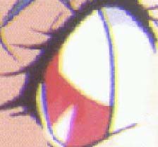
You see ![]() shifted to the right, but what actually happened is
that
shifted to the right, but what actually happened is
that ![]() is the one who shifted.
When a black
is the one who shifted.
When a black ![]() line is on
bright white, the
line is on
bright white, the ![]() plus
plus ![]() makes
makes
![]() .
.
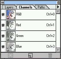
To correct his, click on the channel window (above), select
![]() , then
select your whole selection with (Ctrl)+A, and move with the arrow
keys.
, then
select your whole selection with (Ctrl)+A, and move with the arrow
keys.
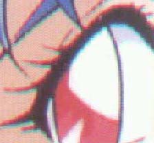 This one you can actually see
 ![]() shifted to the... bottom. It
might seem like its moved up, but don't look at the primary colors (RGB),
look at the secondary (CMY) instead. If you see
shifted to the... bottom. It
might seem like its moved up, but don't look at the primary colors (RGB),
look at the secondary (CMY) instead. If you see ![]() ,
that means
,
that means ![]() and
and
![]() is there but
is there but
![]() is missing out on the party.
is missing out on the party.
Reducing Noises
From the beginning, scanner creates noises, what are noises? Noises are what makes a picture look dirty, looks as if it's been scanned off cheap paper, etc. Wooo, okay, so I'm going to talk about reducing noises, not removing them.
The three steps to eternal happiness not quite. ^^;
- Run Despekle from the Filter/Noise sub-menu
This guy reduce noise, but takes away some detail - Sharpen the image with Sharpen Edges from Filter/Sharpen
- Reduce image to desired size and there you go
unedited, despeckled, and sparpened image.
This is another bad example, but just look at the dark colors.
Of course, this step is only takes place *after* any editing such as removing and adding stuff, but I thought I'd mention it since it's so easy. You can try this on some bad JPEG images that you've downloaded too.
Removing unwanted items
![]() Start by removing all the unwanted items with the white paintbrush.
(colors correspond to lines on the left)
Start by removing all the unwanted items with the white paintbrush.
(colors correspond to lines on the left)
![]() Painted backgrounds like this can be drawn back by the paintbrush. Start
with a high opacity, then work your way down with lower opacity.
Painted backgrounds like this can be drawn back by the paintbrush. Start
with a high opacity, then work your way down with lower opacity.
![]() Curves like that are hard to draw by hand nor the line tool, Paths is
perfect in this situation.
Curves like that are hard to draw by hand nor the line tool, Paths is
perfect in this situation.
![]() When the going gets tough, you'll need all you've got. The Clone tool,
the Line tool, or Paths tool somewhere, it's up to what's suitable.
When the going gets tough, you'll need all you've got. The Clone tool,
the Line tool, or Paths tool somewhere, it's up to what's suitable.
![]() These are the ideal situation. Stuff are on simple areas, where you can
just use the Line tool or the Clone (Rubbber Stamp) tool to restore it.
These are the ideal situation. Stuff are on simple areas, where you can
just use the Line tool or the Clone (Rubbber Stamp) tool to restore it.
![]() There are things that just have to be replaced with your hands, not
unless there's an mirror image. If there aren't, try not to touch
that picture. ^_^;
There are things that just have to be replaced with your hands, not
unless there's an mirror image. If there aren't, try not to touch
that picture. ^_^;
![]() Notice that scans you and I do usually doesn't have *that* much writing
on them. I did this because I'm the Tenchi Nut!!!
Notice that scans you and I do usually doesn't have *that* much writing
on them. I did this because I'm the Tenchi Nut!!!
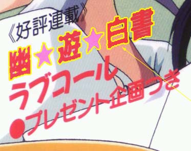
![]() Note to evaluate the image too, if both side of Aeka's crown aren't
visible, I won't be editing this pic because it'll just take too much
time.
Note to evaluate the image too, if both side of Aeka's crown aren't
visible, I won't be editing this pic because it'll just take too much
time.
Part 1
 This is where the fun starts! First use the magic wand and
select anything that you don't want. Of course, something
like the Paint Brush will do too.
This is where the fun starts! First use the magic wand and
select anything that you don't want. Of course, something
like the Paint Brush will do too.
 A general tip for editing. If you set your tool to Darken, (black
arrow) the color you fill will not overdrawn the black lines. Also,
when there are more than one color (ex. hair) start with the lighter
color first then darker ones.
A general tip for editing. If you set your tool to Darken, (black
arrow) the color you fill will not overdrawn the black lines. Also,
when there are more than one color (ex. hair) start with the lighter
color first then darker ones.
![]() The Line tool does all the
easy lines, even slightly curved ones. Try to put more than one line
down but two or three to make it look more natural. Oh yeah, don't
choose Photoshop's default black, it's too dark, choose a black in
your picture instead. just hit (Alt)-K.
The Line tool does all the
easy lines, even slightly curved ones. Try to put more than one line
down but two or three to make it look more natural. Oh yeah, don't
choose Photoshop's default black, it's too dark, choose a black in
your picture instead. just hit (Alt)-K.
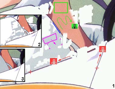
![]() Lasso can be used to
clone large areas. Just select the area you want, hold on to (Alt)
and drag away. (Yes, the example with the purple recangle is pretty bad)
Lasso can be used to
clone large areas. Just select the area you want, hold on to (Alt)
and drag away. (Yes, the example with the purple recangle is pretty bad)
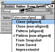
![]() The Clone tool, or the
Rubber Stamp, is the most frequently used tool. The red clone
tools shows you how you can draw lines while copying the colors
beside the lines all in one step. The clone tool can also draw
(sounds like an infomercial) you can either clone another area, or
save your time by selection an area (green rectangle), then assign
it as pattern. (Edit,Make Pattern) Now with the clone
tool set at pattern (above figure) you can draw away.
The Clone tool, or the
Rubber Stamp, is the most frequently used tool. The red clone
tools shows you how you can draw lines while copying the colors
beside the lines all in one step. The clone tool can also draw
(sounds like an infomercial) you can either clone another area, or
save your time by selection an area (green rectangle), then assign
it as pattern. (Edit,Make Pattern) Now with the clone
tool set at pattern (above figure) you can draw away.
Part 2 - Paths
Path is often the only tool to create a suitable curve at situations. From simple to complicated curves, the Path tool does it all.
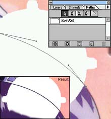 To get started select the Path Window (F5), and you'll see a number of
icons. I suggest reading the manual if you forgot, but the second one
is what you click on at first.
To get started select the Path Window (F5), and you'll see a number of
icons. I suggest reading the manual if you forgot, but the second one
is what you click on at first.
Click on the black line (which got
cut off) and don't let go, now drag it outwards and you'll see that
old diagran used in your awesome Calculus class. That line determines
how much your line curve by. Do the same thing somewhere else, and
a curve line will pop up. Adjust their position and curves with the
arrow icon.
Click on the triangle (options), choose Stroke Path,
and it'll draw a line with the brush size and color you want.
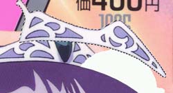 What you see here is the mirror image of the other side of the crown.
I selected it with the Magic Wand too. You'll need to rotate and skew
it a bit to make it fit.
What you see here is the mirror image of the other side of the crown.
I selected it with the Magic Wand too. You'll need to rotate and skew
it a bit to make it fit.
 First of all make your selection to be darken
only so it doesn't cover the hair (figure below), and I found that the
crown looks better if edited seperately, so this is what you see here.
This piece doesn't really go behind her hair, but the next piece does.
First of all make your selection to be darken
only so it doesn't cover the hair (figure below), and I found that the
crown looks better if edited seperately, so this is what you see here.
This piece doesn't really go behind her hair, but the next piece does.
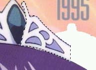
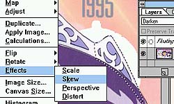 First rotate it till it looks good, then tilt it by using the Skew command.
Part 3 - Small Notes
- Remember to always use the clone tool to draw, since painting will it'll always stand out if you do so.
- If you really have to draw with the brush, select your drawn area later and use the Add Noise command in the Filter/Noise sub-menu.
- If you hate drawing pass borders, just select the area you want to draw with the Magic Wand.
- If you hate selecting with the Lasso (rope) tool, try clicking on something, don't let go and hold (Alt), now let go and you can start drawing straight lines with it.
Joining and splitting images
Don't know why I spent 4 paragraphs explaining this, but simply, first if you're scanning seperate images, be sure to line them up as much as possible before merging them together. To do so besure to scan the side of the paper also. Now with a line width of zero, run your line tool along the edge of whatever you're scanning, and of course the edge should be exactly straight. If not, say, it's 0.2 degrees off, just head to Rotate, Arbituary and rotate it.
When merging images, don't just select one part and paste it in. Use the Quick Mask plus the Gradiant tool to do the merging.
- First click on the Quick Mask button

- Now, click on to the edge of your image with the Gradiant tool
 , holding on to the button,
hold on to Shift also and drag towards the inside. Drag only duplicate
areas that the other image also has, of course.
, holding on to the button,
hold on to Shift also and drag towards the inside. Drag only duplicate
areas that the other image also has, of course.
- Click back onto normal mode (other icon of Quick Mask) and you've just made a selection. If it went the other way around, just inverse your selection.
- If not done so already, use Image/Canvas Size to increase image size of the other image. Now drag your selection right over to the other image and whoala. You can start lining them up now.
Creating Backgrounds for web pages
The only rule to creating backgrounds is to be creative. You can have any patterns in them, either random noise patterns like the one below, or you can scan specific textures and warp them around also.
This is one of a million examples. I created some noise with the
Filter/Noise command, then ran Emboss on it. I can also Blur it out,
Solarize it, or do whatever.
Starting a background is one thing, now you have to wrap the edges around or else they just aren't backgrounds. The procedure is simple:
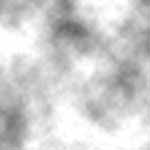
Here I just created some clouds in the Filter/Render sub-menu, then
I embossed it to give it a weird look.
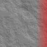
To wrap them around, I clicked on the Quick Mask button ![]() and then do the Gradiant
and then do the Gradiant ![]() thing just like what mentioned in the "Joining
images" section. Take note of where you start and end though. (say,
I started from the right hand side and moved the gradiant for 30
pixels in this example.)
thing just like what mentioned in the "Joining
images" section. Take note of where you start and end though. (say,
I started from the right hand side and moved the gradiant for 30
pixels in this example.)
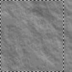
Now going back to normal mode, your selection should look similar to the picture on the right. If not, inverse your selection.
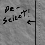
After that is done, de-select from the point where your Gradiant tool left off (in this case, it would be 30 pixel from the side).
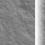
Notice the white on the right hand side image is what used to be the selection. I've just moved it to the other end of the image. Since this example is only 150 pixel wide, the merging is very noticable, but with a larger image and a longer gradiant, the result should not be noticable at all.
Besure to do the same thing for either the top or bottom edge also!
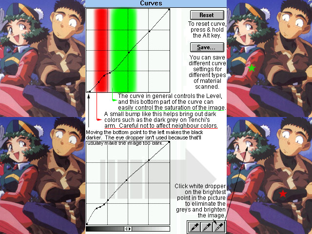
Adjusting colors
This is probably the part that most people neglect to adjust or fail to notice the importance. The proof is the sheer number of images out there that are simply too dark or too bright, or images that doesn't even remotely resemble the original scanned material. Though actually this process is easy and not time consuming at all. See what you can figure out from the picture below, and spend some time tweaking your own images until you have a good feel of the results of color adjustments.
Resizing images
There isn't much in resizing but different sizes does prove pleasing in different ways. Actually, when I refer to resizing I might as well be speaking of shrinking, since it's rarely necessary to enlarge an image, especially when an image's quality decreases dramatically when it's enlarged. On the other hand, shrinking an image can help hide editing mistakes and reduce noises of an image. So let's make sure that all necessary editing and enhancements had been completed before any shrinking is done.
Also, I suggest saving your image before shrinking your image as a mean of back up. Even a JPEG at medium quality is fine, shrinking an iamge will almost take away all flaws made by the JPEG compression. In case you want to make a print-out or a large background for yourself, the larger image is definitely more suitable. Also, saving a large JPEG image will save you more disk space than saving a smaller image in TIF or other lossless formats.
In terms of how large the image should be, I always prefer either a minimum width of 1024 pixel or a height of 768 pixel. Which means landscape images would have a width of 1024 pixel and portrait images would be 768 pixel tall. Why? Because anything larger would need scrolling, and most of us don't bother or wouldn't want to spend time scrolling, and most software does a bad job of "on the spot" shrinking when an image is too big to fit on the screen.
Storing images & image formats
Prior to saving an image, some people might want to put in info such as the character or the anime's name on the bottom corner, while some print their own name and E-mail address for mysterious reasons.
Personally I think that's just lame. I can imagine hate letters rather than compliments if one does that. If you would like to make friends or receive feed backs and so forth. It's always worth the effort to create readme files when uploading your own images. Have a file with the same name but a different extension is what I see most often, and also what I do myself.
The worst one I've ever seen was someone who put his name on an extra banner on the bottom of an image, and includes the message "feel free to crop me off". That one was just too good. (^o^)
Also, name your files right. If your filename looks just like the bunch of images uploaded last year, chances are that people will think it's one of them and ignore it. I named my scans stupidly until the days when I started to download "new" images where half of them turns out to be my own scans. ^_^ That was pretty bad.
Now on with the topic, depending on the image's importance or how much time you've put in it, you might want to save the image in different image formats. Though as mentioned in earlier paragraphs, I prefer saving an image before it's shrunk in size. Anyways, the data chart below compares roughly how much space each type of image format takes up. With JPEG hanging around it's not much of a comparison these days.
| Type | 24Bit Scanned | 24Bit Drawn | 8Bit Dithered | 8Bit Non Dithered | ZIP |
| BMP | 5,254,256 | 5,254,256 | 1,752,480 | 1,752,480 | 75% |
| PCX | 3,869,360 | 2,026,898 | 1,129,005 | 307,082 | 48% |
| TIF | 1,780,812 | 974,964 | 457,748 | 264,734 | 10% |
| GIF | -- | -- | 403,284 | 218,227 | 1% |
| JPG1 | 151,895 | 153,373 | -- | -- | 12% |
| JPG2 | 255,176 | 250,491 | -- | -- | 10% |
| JPG3 | 439,574 | 395,466 | -- | -- | 6% |
-
Images are loaded and saved in Adobe Photoshop Version 3.0
JPG1 = Medium quality, JPG2 = High quality, JPG3 = Maximum quality
ZIP means compression ratio for zipping image up with PKZIP V2.04G
For those of you who are interested in graphic formats and are wondering which ones are better, here's a comparison of all the popular file formats and the space they take up. The image being saved is a 1400 x 1251 anime image. Scanned image means the picture is freshly scanned, with very slight, usually not human noticeable variation in colors due to paper and scan quality. Drawn image compose of no color variation and noise at all made possible by human correction (technique for such is discussed in the advanced section). When I convert the same image to 256 colors, I have a choice to dither the image or not. An image looks really bad without dithering. It's no conversion worth considering. But a non dithering image does have higher compression.
Below is a short preview of the yet to be finished advanced section. Hope this might proof useful to some of you out there...
4. Advanced Image Enhancement and Effects
This is the so-called "advanced" section. They're not necessarily advanced, but most of these procedures just take a hell of a lot of time to accomplish, that's all. Oh, and I haven't added any graphics to this section yet, so they'll be boring as hell to read.
Creating or mixing backgrounds
Creating or mixing a backgrounds means simply the process of seperating the character from his or her existing background so the charcater can then be overlayed on to another image or an empty file to create transparent backgrounds for HTML documents.
The main catch from seperating backgrounds is that the character, or whatever object being seperated always leaves a border with whatever color the background contained. (Usually a white/grey border because the background is white) The trick for removing these types of borders is actually pretty simple. First select your background with the Magic Wand with anti-aliasing turned on. Whatever the Magic Wand have trouble selecting can be adding in using Quick Mask, or the Lasse tool. Sometimes if the background of an image is a primary color such as blue, you can jump to the blue channel, and backgrounds would be much easier to select with the Magic Wand.
After the background had been selected, choose SELECT, SAVE SELECTION. The selection should go to a new channel, such as #4. Choose SELECT, FEATHER by 1 pixel to expand your selected area slightly, and select a background color with the Eye Dropper while holding on the Alt key, aiming at one of the darkest color on the character's border black lines. Or you can also have pitch black as your background color, the effect should be about the same. Now hide the selection (Ctrl+H), and hit the backspace or delete key. You should see that the black is starting to cover the border color. At this point take look around the character and see if any part of the selection is taking off too many colors. If not, then hit delete a few more times to completely wipe out the border colors. After the task has been done, choose SELECT, LOAD to call your selection back out, and there you go, after you copy the character to a new image the character shouldn't have any bordering colors. One note to users planning to make a transparent background for HTML forms, you should have anti-aliasing turned off at the very beginning, or else you'll still see a border color around your image, unless you know that your background color will be grey, and that's the color you're transporting the image into.
Creating noise free images
An un-edited image give away its origin to whether it's scanned from a magazine, a manga cover, or a plastic board because of the defects or noises shown one way or another. While an edited image will hide most of the faults, with a little attention, it's still apparent to the viewer that the image is scanned, but not drawn. The goal of creating a noise free image is mostly for personal enjoyment more than anything else. Besides better printing quality, the only other reason I can think of is for saving disk space when you're planning to save images in a lossless format. Though I must stress that they make very impressive looking OS/2 backgrounds. ^_^ The task of removing all noise really stands for a process of re-drawing the colors of an image, or replacing all colors containing noises with single uniform colors. The process is simple, but very time consuming.
To start off, you should work up to tuning the colors of the image as described earlier in the guide, and continue from this point on. Then it's time to create a map of your working image. By using the CALCULATION command under IMAGE, copy a grey-scale version of your image to channel #4. Goto channel #4, and choose IMAGE, MAP, THRESHOLD. Tune the histogram until you only see the black lines in your image. Choose OK and now select FILTER, BLUR, BLUR MORE, then call out the Levels window, and slide the black and white arrows below the histogram towards the middle to sharpen your selection.
Now comes the task of replacing the colors of your image. Turn anti-alias to off for the Magic Wand, and start with a color of your choice, edit the similarity value if necessary to include all of the same color when you ask for the magic wand to. After that, take the Smudge tool and smudge on the selected area, now choose the eyedropper and select the color inside where you've smudged. When an appropriate color is selected, go back to the Magic Wand and select other colors which are the same. People who want to save time might want to put the similarity value down and choose Select Similar, then de-select unwanted colors which the command chose for you, with the Lasso tool. Then save your selection as channel #5.
Goto channel 5 now, and you should notice that your selection is pretty rough in outline since anti-alias is off. To make your selection smoother, de-select your existing selection, and now choose FILTER, BLUR, BLUR. If the image you're working with is pretty small, then you might want to call out Levels, then do the task again of slide the black and white arrows to sharpen the selection. Then go back to your RGB channel now, and load selection channel #5, choose EDIT, FILL to replace your selection with the color you picked previously. And repeat the same task of selecting and replacing colors.
When all colors are replaced, call out channel #4 as a selection, and fill that selection with black or dark grey. In some cases this step isn't necessary, but it should increase the image's quality. If you have enough RAM space, instead of replacing the selection with black, use the magic eraser (Alt+Click) on the selected areas for a better result.
As for what backgrounds to add the image into is really your choice. I'll furthur discuss this issue on the "adding real life images" section and the "creating wall papers" section on the next version.
Mail to: Derek Liu ([email protected])
Return to Lanzer Land
Mini Glossary. ^^;
Dithering:
-
Mixing small dots of lighter or darker colors to simulate more
colors than what's available in a graphic format or a monitor
screen. (red background + orange dots = orangy red)