Topics
- Introduction (boring whiny crap)
- Readability
- Narration and Scene Changes
- Various Font-Related Notes that Don't Need Their Own Section
- Uppercase vs. Lowercase
- Stressing
- Flanged "I" Usage
- Undertones with All-Caps Fonts
- Tracking
- Leading
- Font Width (I can't believe this has its own section)
- Put Some Life into That Text!
- Let's Talk Bubbles
Font Reviews:
- Markerman
- Astro City
- Jim Lee
- Balloon Lettering
- Anime Ace
- Digital Strip
- Pulp Fiction
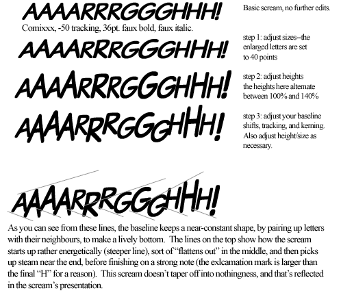
- Comixxx
- Mighty Zeo 2.0 caps
- Mufferaw
- Wildwords
- Unreviewed
but mentionable fonts
Introduction
Choosing and effectively implementing a font is therefore an
important, and unfortunately, often overlooked part of editing. I'll go over quite a few topics here, and
give my opinion on what works best. Some
techniques will work well in certain comics, while others will not look quite
as good. I hope this guide gives enough
information to make an educated opinion as to what should and should not be used.
The whole point of proper lettering is to draw as little
attention to the lettering itself as possible, while enhancing the flow and
presentation of text to visually reflect the events in the comic. Transparent delivery of text is the idea
we're shooting for. Proper
lettering is perhaps the best way to better the presentation of an edited manga and smooth the conversion from Japanese to English
text.
A good localization doesn't reduce the quality of the manga, any more than using slang or colloquialisms (or even
using English sound effects) do. How
this implemented is up to your opinion as the editor, but knowledge of style is
the first step in making an informed decision.
And that's what I hope to help accomplish.
READABILITY
Whether
you use Whiz Bang, ComiCrazy, Kid Kosmic,
Comic Hun, Comic Sans (joking), Komika, Web Letterer,
or whatever, first and foremost make sure the font you use is easily readable. If you have to fit a lot of text
into small bubbles, use a font that scales down well. If your readers have to work to figure out
what you've put in the bubbles, you may want to reexamine your font
choices. While a proofreader should
catch something important like this, not everyone sends a finished copy to a
proofreader, and even then, not all proofreaders will bother correcting
something like this.
NARRATION AND SCENE CHANGES
For narrations, there are three keys points to keep in mind:
- We don't see this too often, but occasionally we'll get stories that are carried in part or in full by narration. Typically, you'll want to use some font other than your dialogue to differentiate between narrative and dialogue. Otherwise it can be difficult to distinguish between what is being said and what is being told.
- For narrations, sans-serif lowercase fonts are preferred since it's a literary rather than graphical way of telling the story. The use of lowercase reflects this, and a font without serifs almost always looks better for this part of the comic.
- Narrations are usually done in italics, unless they're considered to be "notes". That is, the bubbles take the form of a journal or letters or something similar, in which case I recommend using what looks best and if font happens to be italics, great. If not, no big loss. The italics are a visual way of showing that it's "off-screen storytelling".
- Scene
changes: simple and quick. Usually
it's a bubble with a place.
Sometimes it has a time or a date as well. Lowercase or uppercase, your choice. I
prefer lowercase for these as well (since they're similar to narrations), with a font that matches the style. Sometimes you want some kind of medieval
font or a typewriter font (I'd recommend avoiding your more comic-style or
dialogue fonts), it's really up to you and the comic to decide what will
work best here. To keep these separate
from the narrative though, you never italicize the scene changes.
VARIOUS FONT-RELATED NOTES THAT
Sizing Issues
Unless there's a reason (undertoning
or some kind of yelling), try to keep the font size constant throughout the
chapter. There isn't any particular need
to enlarge your font to fill the bubble from end to end, so it's perfectly fine
to go with a font that leaves some margins around your text. It gives a consistent
"volume" to your character's voices.
If text is larger or smaller than normal, it appears the character is
yelling or talking under their breath (which may be the  case. If that's so, go with it). Consistency is the key here. Compare the following:
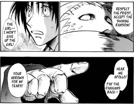
Example done with Zud Juice
On the left, we have sizing that isn't standardized (the right is the "fixed version), and changes between panels (between bubbles in each panel as well). It looks kind of sloppy if it's all supposed to be said at the same volume. If "your arrows for my tears" is being shouted, you'd want to enlarge it (and bold/italicize it as well, but we'll get to that later), but it isn't really said with any more emphasis than the rest of the sentence, so there isn't a reason for making it so large. Likewise, there isn't a reason for making "the girl—I won't give up the girl" or "hear me Apollo!" any smaller than the rest of the text. If at your "standard" font size, then the text wouldn't fit in the bubble no matter what you did to it, you'd obviously want to shrink it a bit (read the "Let's Talk Balloons" section for a few more ideas on this as well) to fit the bubble, but in this case, the text fits just fine.
Of Fonts and Men
Occasionally, you'll come across one of those "different fonts for every character" edits. As you'll have several fonts on a single page, all fulfilling the same function (dialogue), when there is no actual difference between the characters, this can get either confusing or just plain excessive. I go by the rule "if the character sounds different than a normal person for the manga, change their font". Only excessive cases (like a talking robot or something) get their own font.
It's Greek to me
Anything in foreign language gets typed in English, and placed in <these less than/greater than brackets>. If it's not explicitly mentioned in the comic already, drop a note in the margin letting the readers know which language it's supposed to be in. There's no need to italicize or change the font or anything like that. Simple problem, simple solution. Usually you won't need a note specifically saying "the Russian mobster is speaking Russian", as your reader can quite easily figure that out.
UPPERCASE VS. LOWERCASE
A lot of comics use all uppercase fonts. In all fairness, most comics do, though this is changing, and we're starting to see more and more comics done in lowercase (Marvel Comics, for example, uses the lowercase font "Up Up and Away" for their dialogue now. See the example below for a sample of what that looks like), however all capital letters are a very ingrained style in comics, and it can be rather difficult to get used to the transition between all-caps and lowercase.
Capital letters are a throwback to the good old days when
letterers actually hand-lettered the comics, before these wacky "fonts" and
"computers" came and stole all the jobs from honest Americans and gave them to
This doesn't mean you should use a lowercase font. Some manga just doesn't work well with lowercase, it looks awkward and out of place, and that has everything to do with the fact that we're not inserting our own speech bubbles, we have to fill what's already given to us. So match the case to the manga. But if you've got something text-heavy, or very small speech bubbles, I suggest trying out some lowercase fonts to see if they fit the style of the manga. It can be much easier on the eyes, and since lowercase letters are smaller than their capital counterparts, it reduces the page real estate needed for the dialogue. Since uppercase is already the standard in most manga groups, I'll be covering lowercase usage here.
Uppercase can sometimes be a bit difficult to follow in large blocks of text, relative to its lowercase counterpart. Usually when you have all uppercase lettering, you can get about two sentences, maybe five or six normal lines before you start to give the reader "information overload", and their eyes skip letters or whole words throughout the bubble. A good uppercase font reduces that, and can probably squeeze another line or two out of the reader's attention, but you're still left with a reader paying only partial attention to the bubble. Fortunately for us, most manga doesn't have this much dialogue per bubble to deal with, and we can use uppercase fonts just fine in most cases. But to give an example of how attention and readability between an all-caps and a lowercase font in large blocks of text differs, take look at the following example:
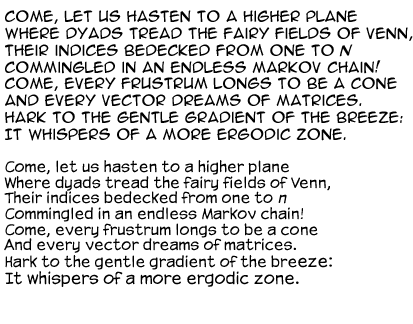
Example done with Anime Ace
and Up, up, and away
Another reason lowercase fonts are useful because you can fit more text in bubbles than with uppercase fonts. This can be pretty helpful when trying to fit more letters in those narrow bubbles that manga is so famous for. Breaking up words and putting part on two separate (or, god forbid, three) lines gets kind of annoying to most readers, especially when you do it more than once or twice per bubble. Lowercase lettering reduces the number of times you need to break up words.
Now, lowercase fonts typically don't look as good when you crank them up to, say, 48 points and still keep them lowercase. They're better when they're kept a relatively "normal" size (you don't even need to go all the way to the edges of the bubbles, you can leave yourself some breathing room on the sides). If for some reason you do need to increase the font size, I suggest just hitting caps-lock and then using all uppercase letters for the bubble. A good example would be yelling or screaming. Someone yelling in lowercase just doesn't have quite the impact of all capitals, so that would be an appropriate time to switch.
If you do decide to use a lowercase font, I recommend using
lowercase throughout the entire manga—especially if
you use several dialogue fonts. It's
quite strange to see one person talking with lowercase lettering
STRESSING
We use stressing because comics are primarily a visual medium. In a novel, you typically get a feel for how a character says something based on how he or she says it, rather than what he or she says. In comics, you don't typically have that degree of subtlety. A sentence is typically read as it's shown, which means that emphasis and variations of speech need to be reflected in text style. Picture the text bubbles as simply another portion of the panel's art, rather than a separate portion "where the words go". Remember that readers pay attention first to the text, second to the art. The panel is simply a snapshot of the events taking place inside the bubbles.
Stressing is the bolding (and italicizing, if it's not
already included in the font's bolding) of words within the sentence. I highly recommend getting used to doing this,
because it's a very powerful tool for letterers. A sentence reading: "Where is this car
going?" could change meanings depending on your stressing:
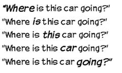
Example done with Up, up, and away
These minor changes in emphasis can really alter the way the sentence reads to the viewer—each of these sentences means something slightly different, and when used properly, this really livens up the dialogue. Not using any stressing at all makes your characters flat, monotone. Your characters have feelings; use stressing to bring those out in the dialogue.
It helps when just getting used to using stressing to run the sentence around in your head, to make sure you're stressing the right words. Sometimes, you'll go an entire chapter without stressing anything. Other times, you'll be stressing multiple words on every page. Just be careful about which words you stress, because if you continually pick the wrong words, it comes across as rather heavy-handed and overdone. But when done right, this is a great way to liven up your dialogue. A few common mistakes include stressing nouns, unusual words, or spoken actions (like "run that way!"). Certainly there will be a time when these are the words you should be stressing, but typically they're the words you see stressed when there shouldn't be any emphasis on them. Again, while you get used to figuring out which words to stress, try saying the sentence aloud to see if it sounds right to you.
Now, there is a time and a place for stressing, and there's good and bad stressing. You don't want to overdo it by stressing words that don't have any special emphasis in the dialogue. If you do this too much, you get awkward, jerky sentences. You don't need to stress "thirteen millimeter socket wrench", for example. Bad stressing will put words in bold just to break the uniformity of the text, regardless of how it affects the dialogue or sentence flow. Good stressing brings out emotions and feelings, puts force behind key words without reverting to all uppercase letters. Let's compare here:
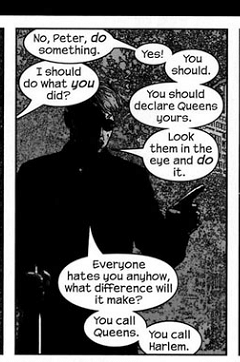
Left
Image: Ultimate Daredevil (good stressing) Right
image: Cannon God Exaxxion vol. 1 (bad stressing)
On the left, we've got someone confronting another person. This isn't left for the reader to interpret, it's given visually in terms of the word choice for stressing. The words that make the dialogue forceful and confrontational are stressed. In the very first bubble, for example, we have "do" stressed. This changes the sentence into more of a command than if, say, "something" had been stressed instead (which would have given this bubble a tinge of desperation instead).
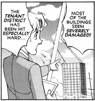
On the right, we've got "tenant district", "especially", and "severely damaged". Now, tenant district isn't really something anyone would stress in a normal sentence, it falls under that "noun" problem I mentioned earlier. "Especially" is probably the only word in this panel that I would stress, but even that doesn't really strike me as a necessity. When looking at "severely damage", the stressing here is rather redundant with both "severely" and the exclamation. I could see "severely" stressed by itself, to emphasize the extent of the damage (or if it's just a whiny character in general), but think it's a tad excessive, given that it's already got an exclamation in there.
You can also use stressing to help with your dialogue options. A sentence without stressing would likely look something like this:
"I know you've got it hidden somewhere. McIness!"
"I know you've got it hidden somewhere, McIness."
"I know you've got it hidden somewhere, McIness."
As you see, our sentence is no longer an exclamation, it's now a statement. Especially for your calm-and-ruthless villains, this really helps with showing character and personality.
In addition, (for all-caps fonts especially) when you've got giant blocks of text, bolding a few words here and there kind of "breaks up" the bubble by eliminating the uniformity of single-size text. It makes it read a bit easier to read.
TO FLANGE OR NOT TO FLANGE
There are, with most all-caps fonts at least, two forms of the letter "I". One has the two bars on the top and the bottom, making it a flanged I. I don't know if there's actually a real word for that, so…whatever. The other form of "I" is a simple vertical line. The difference in use is not simply "capital "I"/lowercase "I""—there's a very specific use for the flanged I, and that's for pronoun forms of "I" only. If you have a capital "I", such as at the beginning of a sentence like "It did", use the simple vertical line form, not the flanged form.
See how good the second line looks compared to the first? It may seem a rather minor thing, but it does look much nicer, and requires very little work to implement.
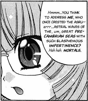
UNDERTONES WITH ALL -CAPS FONTS
When you've got some dialogue with all caps fonts that has "heh heh" or possibly "hmmm", and similar forms of speech, it looks a bit strange to see that as

With the part muttered almost under the character's breath "Hmm" the same size and emphasis (as it is all capital letters) as the rest of the sentence. You can drop the size of the "Hmm" a bit, but that does look a bit obvious and ungainly. What I recommend is using a similar font that has a lowercase set and italicizing that. The reasoning here is the same as the reasoning behind stressing: we want the lettering to visually express the dialogue.
Example
done with Comic Font Hun for the dialogue and Shorthand
And there we go. The appearance of the text now matches what the flow and tone of the dialogue. We do this unobtrusively and without drawing attention to the actual letters or fonts. And as a letterer, there is nothing more important than that. Seems kind of strange, but if no one really notices our work, that's the surest sign we've done our jobs right.
Now, if you're using a font that has a lowercase set already, you don't really need to bother with this step, just italicize the undertones and move on.
If you use an all-caps font you don't really need to concern
yourself with matching up the font to the one you use for dialogue exactly, a
similar match will do. The example above
shows how this works. The undertones (by
design) do not draw a lot of attention to themselves, they're not intended
to. A few fonts that work well for
undertones include: Technics WS, Gemelli,
SF Cartoonist Hand, Andy Bold, Oil Bats, or Shorthand Normal. There's no need to find something that fits
your dialogue font "perfectly", just pick something that looks good in italics
and isn't incredibly different from your dialogue font.
TRACKING
Some fonts handle spaces
between letters pretty well, and you really never think twice about it, and can
just leave it at default. Other fonts,
particularly the poorly-made fonts, have letter pairings that have exceedingly
wide spaces between the letters or too little space, making certain letters
collide with each other.
When you use a font, pay attention to these spacings for several reasons. The first is that if you really need to fit that word on a line and you just barely don't have the space for it, you can drop your tracking by 25 or 50 ems (this the unit, but isn't labeled in Photoshop, it just gives you a number) and give yourself just a bit of room without making it apparent you're trying to cram this stuff in. The other reason is that when you have fonts that either have too much space between the letters or not enough, you need to manually adjust your tracking (or kerning). In Photoshop this is no problem at all, just open up your handy character window and set the number to something that makes the spacing look appealing. Then remember to set it back to the default (zero) when you're done. Otherwise you'll realize you've gone several pages of dialogue at +50 or so, and that's no fun to have to change. Of course, if you're using those levels to make your lines fit a specific space, then by all means, go ahead. No QAer will ever catch improper kerning or tracking, so it's up to you as editors to do it.
LEADING
On the same token, you can adjust the leading (space between lines) as well. Most fonts could use a bit of vertical alignment to look better—usually it's lowering the leading, to below its default amount. There's no need for a ton of white space between lines.
FONT WIDTH
If you need some extra space for a word to avoid breaking it up (and please do, broken-up words are something to avoid as much as possible), then adjust your letter width. I wouldn't go past about 93%, though, as your letters start to look a bit like that stick-figure girl from Ally McBeal who is so obviously anorexic it's not even funny. The reduced width doesn't hurt the form or substance of the lettering any, so feel free to use this OCCASIONALLY. If you find yourself continually strapped for space, reduce the font size or choose a different font. To see this in effect, take a look at the fixed version in the "Let's Talk Balloons" section.
PUT SOME LIFE INTO THOSE
LETTERS!
Give your letters vitality when appropriate. Compare the following:
Example done with Comixxx
See? You can work it up a bit. Voices aren't flat and monotone, they've got spring and vibrancy, especially when they're yelling. It's the same basic principle as stressing, you don't want to just "give the information to the reader", you want to dress it up, give it style and substance. And when you're done, you can scale/distort the result as necessary by rasterizing the layer to fit your need:
Be careful not to go overboard on the transform options, as you'll end up with something that's difficult to read or that looks bizarre.
LET'S
When laying out your bubbles, there are a few basic ideas to keep in mind. The first thing I think about is how to order the text in such a way that I get a normal-sized or smaller-than-normal width line at the top, average-length middle lines, and a smaller line at the bottom. That gives the general flow of the text as a whole a "bubble" appearance.
|
Lorem ipsum
dolor |
Lorem ipsum
dolor sit |
Lorem ipsum
dolor |
Lorem ipsum
dolor sit |
|
|
sit amet, consectetuer |
amet, consectetuer
adipiscing |
sit amet, consectetuer |
amet, consectetuer
|
|
|
adipiscing elit. Praesent |
elit. Praesent ultricies lectus |
adipiscing elit. |
Adipiscing elit. |
|
|
Ultricies lectus sit
|
sit amet ante. |
Praesent ultricies lectus |
Praesent ultricies |
|
|
amet ante. |
|
Sit amet
ante. |
Lectus sit amet
ante. |
|
The first two columns fit the general "round, bubble-shape" that we're looking for. The third column does as well, but I included it to point out that middle line is smaller than the ones above and below it, which gives it an amateur, tagged-on look (unless this bubble is nearly square, in which case it's actually more appropriate than the others). The fourth column has large top and bottom lines as well as the narrow middle, which gives it a concave "anti-bubble" look, and doesn't fit into any bubbles very well.
Let's take a look at the example of lettering that just "puts text in the bubble" without any particular regard for how it flows:
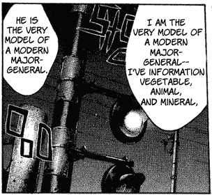
The key point to avoid here is the extremely varied line lengths. If your bubbles look like the one bubble on the right, with long and short lines, either words need to be broken up (in the rare instance this is your only option), or individual lines need to be adjusted to deliver the information in a more "natural" fashion. With some slight editing, we can make this bubble look quite nice:
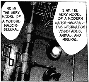
Now what makes this different than the previous example? First, the letters are arranged in a manner that takes advantage of the available line space more efficiently. Secondly, when some parts did not fit very well, I used some of the ideas I've mentioned previously to make them fit. The words "Major-General" and "I've information" are both exceptionally wide at their default levels, and run into the edges of the bubbles. So I set both of those lines to 93% width and -25 tracking.
This made a large "step" effect, where the lines "vegetable/animal, and/mineral," were very nearly the same size. To fix this, I set the word "vegetable" to 103% width and +25 tracking, so the bubble tapers down to the bottom. For the same reason, I did the same thing to "of a modern"
On the left bubble, I simply lowered the width of "general" on the last line to 93% and -50 tracking while enlarging "Major-" to 105% and +25 tracking. This avoids the problem where your last line in a bubble is longer than the one above it (well, it still is here, but not by a material amount). This particular issue is occasionally unavoidable, but it's best to minimize the damage wherever possible. It's a stylistic issue to be aware of, but not overly concerned about.
Let's discuss a bit about various text layout inside
balloons. Specifically,
putting punctuation on a separate line.
Yes, I know it's a common thing to see in manga. However, it doesn't look very good in
English, so we're going to place the exclamation marks adjacent to
"Brown". If you really need to add
several exclamation marks, then just reduce the font width a tad, lower the
tracking, or (and easiest) simply rearrange the bubble:
Hey--THAT'S
JOHN BROWN
!!!
Yes, I know it's a common thing to see in manga. However, it doesn't look very good in English, so we're going to place the exclamation marks adjacent to "Brown". If you really need to add several exclamation marks, then just reduce the font width a tad, lower the tracking, or (and easiest) simply rearrange the bubble:
Hey--
THAT'S
JOHN
BROWN!!!
Voila! Small changes, and we get a nicely arranged bubble.
Now, if your exclamations are an independent thought from the dialogue in question, put them on their own line (usually they already have their own bubble), rather than sticking them to the nearest text. In our case, if the "!!!" was unrelated to suddenly seeing John Brown, then it would go on its own line, as in the first example.
And now what happens when we have a positively unworkable bubble? If it contained a single character or a single column of text, and you're faced with the daunting task of filling that with text? The solution is fairly simple, fortunately.
If your narrow bubble doesn't cover much of the actual art, or if the portion of the art isn't something that's going to be missed, just expand your bubbles. Drag the borders into the margin, over some of the rest of the panel, etc. This will give you the kind of space you need. It's not the best solution, granted, but you'll find that a lot of times you're dealing with text bubbles overlaying margins that aren't over anything. Just white space and gradients:
Here, all I did was rotate the bubble, then shortened it to fit the actual text it contained (no sense in more space than I need). If this had been the bubble on the left, I could have expanded it vertically quite a bit to give me more writing space. The bubble on the right could expand downward a bit (not too much, as it'll start to cover the notebook), and the tail would have to be adjusted, of course. And none of the art was covered up. You'll find that you rarely have to do this, and when you do, there's usually room to expand your bubbles in the panel without harming the art.
If the idea of altering the "art" of the panel doesn't particularly appeal to you, there are a few other ways of fitting text. Notably lowering the size, breaking up your words, reducing letter width by an extremely high amount, and adding a white outline (with a second, thinner black outline around this, only where it exceeds the bubble's space). I prefer simply adjusting the bubble as necessary (only when it doesn't overlay important parts of the image—this is very important, you don't want your bubbles running rampant and taking over the panels) to these methods, but it's your choice as to what looks best in each situation.
FONT REVIEWS: THE GOOD, THE BAD, AND THE UGLY
Now, fonts are not one-size-fits-all. You've got to match the font to the manga. Some manga, you want uppercase fonts, some you don't. Some you want a harsher font like Markerman, some you want a more cartoony font like Jim Lee. Depends on the manga you're doing, so pick wisely. Here, I'm taking some of the more popular fonts and evaluating them so you can make a slightly more informed decision on the font you use.
Markerman
9/10
 Markerman
is one of my personal favorite fonts. For almost any form of manga, it works
splendidly. The letters are vibrant,
active, they really draw the reader's eye along the line. It's easy to read, scales very well, the
default kerning is just about flawless (the right side of the "a" could use a
bit of work, I think), and the font is aesthetically pleasing in large blocks
of text.
Markerman
is one of my personal favorite fonts. For almost any form of manga, it works
splendidly. The letters are vibrant,
active, they really draw the reader's eye along the line. It's easy to read, scales very well, the
default kerning is just about flawless (the right side of the "a" could use a
bit of work, I think), and the font is aesthetically pleasing in large blocks
of text.
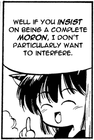
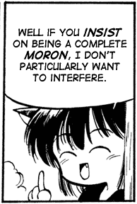
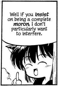
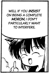
So why not a 10/10? Two simple reasons: there is no natural bolding. If you want to stress a word, as you see in "insist" and "moron" here, you need to faux italic and faux bold it. For proper stressing, you also need to increase the font size by one point (or half a point, if you place text after you scale down to 1200 pixels height).
In addition, there is only one form of each letter, which is a drawback when dealing with consecutive letters. The unflanged "I" you see here is the letter 1 in place of an "i".
This is one of the best free, all-purpose comic fonts available, and I highly urge you to add this to your collection if it is not a part of it already.
Astrocity
7/10
A
well-made font that looks a bit thick, but works out pretty well in a variety
of comics. Small problems include:
bolding doesn't increase the physical size of the letters (it should), so you
need to up the font size of stressed words for proper stressing. The thickness of the font works out quite
well if you find yourself stressing a lot of words, though, because the
stressed words don't stick out like sore thumbs quite so much. The font is a bit on the simplistic side,
but there are alternate forms of each letter, depending on which case you use
(it IS an all-caps font, there are small variances between upper and lower
case, which is a pretty big plus). The
letters do look kind of, ah, lifeless though.
There isn't much spring in them, the tops of the letters make a
near-solid line, and the bottoms aren't much better (compare it to markerman,
above). Still, this is just what some
manga calls for, and the font itself isn't particularly repugnant to look at,
though if you're dealing with large blocks of text, the thickness of the
astrocity would give most readers a bit of trouble.
Jim Lee
8/10

An extremely cartoony font that I would never consider putting in a more serious manga. However, for some of the more lighthearted stuff, I highly recommend this font. The letters are vivid, they carry a good balance between the upper half and the lower half of the letters (something nearly all of the "really cartoony" fonts fail to do), and looks quite good, even in large blocks of text. The letters give some life to the dialogue, and the reader's eye is drawn along the flow of the lettering, making it easy on the eyes—another big plus for dialogue-heavy manga. No natural stressing means it's DIY again (see how to in the markerman description), but this font also includes multiple forms of each letter, similar to Astrocity, which makes it a step above most other fonts. Scalability isn't perfect, but it's better than most. The font is medium-thick, which gives the letters a bit of weight behind them (not too thin, not too thick). You'd be hard-pressed to find a font that works better in less serious comics than this one.
Balloon Lettering
6/10
 This
is actually a lowercase-capable font, but I personally think the lowercase
looks quite hideous. However, using
all-caps we get the example on the right.
I personally don't use this because it's far, far too thick. However, if you're dealing with small
omakes, single page takes, or very small blocks of text, this font does have a
pretty good niche that it can fill. The stressing you see is natural, which is
a benefit, and it looks quite at home with the rest of the unstressed letters
(not always the case, as you'll see).
The letters have a decent amount of personality to them, moreso than
astrocity, at least. As I said, this is
a pretty solid niche font that you might want to keep in mind, but it's a bit
too thick for regular usage.
This
is actually a lowercase-capable font, but I personally think the lowercase
looks quite hideous. However, using
all-caps we get the example on the right.
I personally don't use this because it's far, far too thick. However, if you're dealing with small
omakes, single page takes, or very small blocks of text, this font does have a
pretty good niche that it can fill. The stressing you see is natural, which is
a benefit, and it looks quite at home with the rest of the unstressed letters
(not always the case, as you'll see).
The letters have a decent amount of personality to them, moreso than
astrocity, at least. As I said, this is
a pretty solid niche font that you might want to keep in mind, but it's a bit
too thick for regular usage.
Anime Ace
5/10
 I
am going to start this font with a positive comment, and then I will get into
why this font is an atrocious plague upon mankind. Fair enough? Anime Ace has a very technically sound stressing. I like it, and wish all fonts did this. That being said, this font has terrible
kerning, the letters have little no flow, they clash with each other, they're
way too bulbous and topheavy (just look at those "Rs" and "A"s), it alternates
styles between curved/cartoony approach and severely-cut lines ("M" and "N"
being two obvious offenders) which make it look like you're using two separate
fonts. The F and E look nearly
identical, which is pretty unfortunate since 80% of the letter is above what should
be the middle-mark (the crossline on the A, the lower part of the R's
loop), which means the reader's eye barely registers the bottom portion of the
letter and makes for poor, confusing readability. I mean, look at the bottom of
that line. It's like one straight,
solid line, even across the "A". That's
barely what an "A" even looks like! That's a triangle! Distinction between letters that aren't even
similar (the "R" and the "P") is poor, and forces the reader to concentrate on
the individual letter rather than the word and bubble as a whole.
I
am going to start this font with a positive comment, and then I will get into
why this font is an atrocious plague upon mankind. Fair enough? Anime Ace has a very technically sound stressing. I like it, and wish all fonts did this. That being said, this font has terrible
kerning, the letters have little no flow, they clash with each other, they're
way too bulbous and topheavy (just look at those "Rs" and "A"s), it alternates
styles between curved/cartoony approach and severely-cut lines ("M" and "N"
being two obvious offenders) which make it look like you're using two separate
fonts. The F and E look nearly
identical, which is pretty unfortunate since 80% of the letter is above what should
be the middle-mark (the crossline on the A, the lower part of the R's
loop), which means the reader's eye barely registers the bottom portion of the
letter and makes for poor, confusing readability. I mean, look at the bottom of
that line. It's like one straight,
solid line, even across the "A". That's
barely what an "A" even looks like! That's a triangle! Distinction between letters that aren't even
similar (the "R" and the "P") is poor, and forces the reader to concentrate on
the individual letter rather than the word and bubble as a whole.
In addition to that, this font is incredibly wide, which we ALL know is going to mean that you're going to either cram your letters into the tiny little space you DO have, or you're going to have to snap them in half and put them on two lines. Both options suck. And by coincidence or not, so does this font.
So why is it so used? I have no idea. I bet it's because it has "anime" in the name, so that magically implies that it's a fabulous font and would go GREAT with manga, right? RIGHT?
If you bold it, it serves passably well as an SFX font. But that's about it.
Digital Strip
6.5/10
This is another one that confuses me as to why it's so used. Maybe it's the availability of it. While I certainly prefer this to the aforementioned anime ace, I still think this is a static, lifeless font with zero personality. The letters themselves aren't particularly too pleasing, though it does have a good balance between the upper and lower half, and excellent bolding. The kerning is sketchy at times, but overall fairly well executed. It's a good font for, say, a robot. But it's a bit too monotonous with sharp edges and severe lines for a "regular" character's speech. I think Astrocity pulled this style of font off much more successfully than digitalstrip, and anything you'd use digitalstrip for, I'd recommend using astrocity instead.
Pulp Fiction
8/10
 Wait.
Stop right there. Serifs, lowercase
cartoony font? That doesn't look
like complete crap? Unbelievable.
Wait.
Stop right there. Serifs, lowercase
cartoony font? That doesn't look
like complete crap? Unbelievable.
I would have said the same thing before I found pulp fiction, yet somehow this font manages to look utterly FANTASTIC in just about every comedy manga it goes in. Its slim letter profile means you get plenty of text for your page real estate, and the rich and lively letters make every bit of that space a complete joy to read. The serifs do an excellent job of drawing the reader along the text, while the lines have just enough vibrancy to make it an exciting experience. No real stressing, which is a minus. In addition I think some letters don't have default kerning as well as they should. However, being lowercase, it looks great in large blocks of text
Comixxx
9/10
 This
is another highly recommended font. Two
forms of each letter (all uppercase) give this font a bit of variety. The font itself is pretty vibrant but
restrained, a good tradeoff between the ultra-cartoony Jim Lee and the severe
cuts of Digital Strip. It's got more bounce in its lines than Astrocity, which
is why I'd recommend this font over astrocity.
No natural bolding or flanged "I" (a situation I remedied myself by
using fontographer, but I used the original for this example), but the clean
lettering, the even symmetrical flow of the letters, both horizontally and
vertically, as well as some very tasteful kerning make this an extremely
visually appealing font for all comics.
This
is another highly recommended font. Two
forms of each letter (all uppercase) give this font a bit of variety. The font itself is pretty vibrant but
restrained, a good tradeoff between the ultra-cartoony Jim Lee and the severe
cuts of Digital Strip. It's got more bounce in its lines than Astrocity, which
is why I'd recommend this font over astrocity.
No natural bolding or flanged "I" (a situation I remedied myself by
using fontographer, but I used the original for this example), but the clean
lettering, the even symmetrical flow of the letters, both horizontally and
vertically, as well as some very tasteful kerning make this an extremely
visually appealing font for all comics.
Mighty Zeo 2.0 caps
8/10
Mighty Zeo is the perfect example of how to make a font
technically sound. The letters flow
along the line quite well (the upper half is a bit higher than normal, which
gives  them
a tall and lanky feel), as well as interact well with the other letters in the
set. No font-clashing here, and the
kerning is, for the most part, spot-on.
It gives the lines some vibrancy without going overboard like Balloon
Lettering. The font itself is far too
cartoony for many types of comics, but works just right for a lot of the
lighter comics. The letters are fairly narrow, which really helps when trying
to get a lot of text in relatively small bubbles. In addition, this font sizes up perfectly, but tends to break up
at extremely small sizes.
them
a tall and lanky feel), as well as interact well with the other letters in the
set. No font-clashing here, and the
kerning is, for the most part, spot-on.
It gives the lines some vibrancy without going overboard like Balloon
Lettering. The font itself is far too
cartoony for many types of comics, but works just right for a lot of the
lighter comics. The letters are fairly narrow, which really helps when trying
to get a lot of text in relatively small bubbles. In addition, this font sizes up perfectly, but tends to break up
at extremely small sizes.
When I said "technically sound", this font does everything just right—the kerning, the stressing (that's normal "bold", there), the flow of the letters both along the line as well as at the top and bottom (giving it just enough life without being overly bouncy), and the leading. In addition, this font has the {cough} effect lines (the { and } keys), which is invaluable. It's shocking that most comic fonts do NOT have these symbols, because they're such standard characters that it's a rarity to find comics done without them these days. If this cartoony style works in the manga you're editing, this is a wonderful font to use. I find myself adding the effect lines of Mighty Zeo into other fonts that don't have them with fontographer (slightly adjusted to fit the font, of course).
Mufferaw
7/10
 Mufferaw
is a pretty static font with no natural bolding. I think the letters are fairly lifeless and uniform—the all seem
to take up the same general amount of space, and their harsh vertical flow
means "each letter has its territory".
There's no real flow between them, like there is in Markerman or
Astrocity. Compare the words "you" and
"want" to see what I mean. The letters
just don't work together very well, and it gives the dialogue a really spotty,
monotonous feel. It doesn't help that
the top of the line and the bottom of the line are relatively flat, which only
adds to the lack of vitality in the lettering.
Mufferaw
is a pretty static font with no natural bolding. I think the letters are fairly lifeless and uniform—the all seem
to take up the same general amount of space, and their harsh vertical flow
means "each letter has its territory".
There's no real flow between them, like there is in Markerman or
Astrocity. Compare the words "you" and
"want" to see what I mean. The letters
just don't work together very well, and it gives the dialogue a really spotty,
monotonous feel. It doesn't help that
the top of the line and the bottom of the line are relatively flat, which only
adds to the lack of vitality in the lettering.
On the plus side, this font has two forms of letters, which can be used to spice things up a bit, but I don't find that makes up for the lifelessness in the font. I guess I'd prefer this to Digital Strip, though. However, if you're looking for a font of that nature, I'd recommend using Comixxx instead.
Wildwords
7.5/10
 This
is another pretty popular font, and it's not too bad. It doesn't scale down very well, but scales up just fine. There are multiple forms of letters which
gives it a bit of life, adding to the already vivid lines that this font
makes. I do have a few complaints about
it, though. Namely, the letters run
into each other quite frequently at the default kerning, and some don't work
together very well. Look at the "don't"
in the sample to the left to see what I mean.
This gets very old very quickly, especially when it's happening in near
every text bubble (which it will with this font). The "E"s are rather annoying and unappealing to the eye, and
while they do draw the reader along the page, they give the bottom of the line
a rather harsh and jagged look (this applies to both forms). However, when the letters do work together,
they work very nicely. "particularly" in
the sample is a great example. The flow
between the "T-I-C-U-L" is as good as anyone could possibly ask for. In addition, bold-italics work fine by
itself for natural stressing, which is a plus.
The letters look a bit to think, and really start to clash with each
other if you use sharp or strong anti-aliasing, though, so I'd avoid them, and
stick to either smooth or crisp (I prefer crisp myself). This is a nice general-purpose font that
works quite well. I won't say it's the
best out there, but it's certainly of the better ones.
This
is another pretty popular font, and it's not too bad. It doesn't scale down very well, but scales up just fine. There are multiple forms of letters which
gives it a bit of life, adding to the already vivid lines that this font
makes. I do have a few complaints about
it, though. Namely, the letters run
into each other quite frequently at the default kerning, and some don't work
together very well. Look at the "don't"
in the sample to the left to see what I mean.
This gets very old very quickly, especially when it's happening in near
every text bubble (which it will with this font). The "E"s are rather annoying and unappealing to the eye, and
while they do draw the reader along the page, they give the bottom of the line
a rather harsh and jagged look (this applies to both forms). However, when the letters do work together,
they work very nicely. "particularly" in
the sample is a great example. The flow
between the "T-I-C-U-L" is as good as anyone could possibly ask for. In addition, bold-italics work fine by
itself for natural stressing, which is a plus.
The letters look a bit to think, and really start to clash with each
other if you use sharp or strong anti-aliasing, though, so I'd avoid them, and
stick to either smooth or crisp (I prefer crisp myself). This is a nice general-purpose font that
works quite well. I won't say it's the
best out there, but it's certainly of the better ones.
I'm leaving out several fonts that I feel really don't
deserve their own space:
Komixation Hand, Letter-O-Matic, Dom HU, Up, Up, and Away, and Arch Rival. These fonts aren't too widely used, and they really shouldn't be for various reasons. Most of them bear resemblance to fonts mentioned here already (save for Dom HU and Arch Rival), or are so similar, but inferior to, one of the ones in this list that you can match up and compare the results yourself. Up, up, and away is not included because it is a licensed font by Marvel Comics, and not allowed for public use (if you've seen the new Marvel Comics' font, they're all done in a uniform lowercase now, and this is the font that they use).
This page was created for
the benefit of the manga-scanning community in the sincere hopes that at least
one person, maybe two people, will improve their lettering abilities, and in
doing so, drastically improve the presentation of the manga they edit. One font does not fit all manga, and I urge
you to choose the most appropriate one.
Feel free to browse the fonts presented on this page in making your
selection. It's worth it to spend a
minute or two trying out various fonts to see which looks the best.
Yeah I know this page
looks like crap, I did it by typing it up in word and saving it as an html
file.
If you have any
questions/comments/what have you, please email me at [email protected].