Index
Cleaning Scans
Typesetting
Saving Files
Advanced Stuff
4. Advanced Stuff
4.1) 2pg Spreads
This is often the single hardest aspect of manga editing. When you have a frame of art that spans 2pgs (sometimes, even if the raws come pre-cut one pg at a time, you still should join them), it's your job to put them together. There are 2 ways to do this. The first "lazy" way is simple. Using the rectangular marquee tool, select one of the pages, copy and paste so that it's a separate layer, then hit CTRL+T to free transform. Manually rotate and move the page so that it's horizontal, and there's a little space in the middle. Repeat with the other page, making sure that any lines that would span the gutter are lined up. Then, simply erase the middle, draw vertical lines (paintbrush 100% hardness, pixel width that matches other frame borders, click, hold SHIFT, and drag vertically) to create your own frames. Then, proceed as you would any other page.
The better way of doing things is to fill in the missing gutter art. As before, select and transform each page so that they're lined up. Then, using whatever tools you may deem necessary, reconstruct the art until the page looks like one. For difficult to duplicate patterns, it may be useful to select an area from another part of the page, paste it as a separate layer, then free transform, rotate/flip, level, burn/dodge, and trim off with the eraser until you have the desired section. Then flatten the image.
When you have satisfactorily joined the 2 sides, make sure you removed any gutter shadow. Level both sides simultaneously if you had 2pg raws, otherwise level each half individually to match the leveling of the other half (it may help to level prior to reconstructing the art). Because of gutter shadow, it may be necessary to heal the center to achieve a gradual transition, should the darkness on either side of the gutter be different. Another way is to simply burn or dodge the midtones on either side to match the other. If there was a lot of redrawing involved and the gutter region doesn't really match either side, it may prove useful to perform a burn/dodge cycle. Using an extremely large brush (several hundred pixels), still 0% hardness, select the burn tool on midtones, and quickly burn the area surrounding the gutter. Switch to the dodge tool, set to midtones, and dodge the previously burned area. This helps to even out the two pages. Another trick to help make the page look uniform is to use features (streak lines or whatnot) that span the gap and parts of both pages (think staples), or alternate features from different sides of the gap (think zigzags).
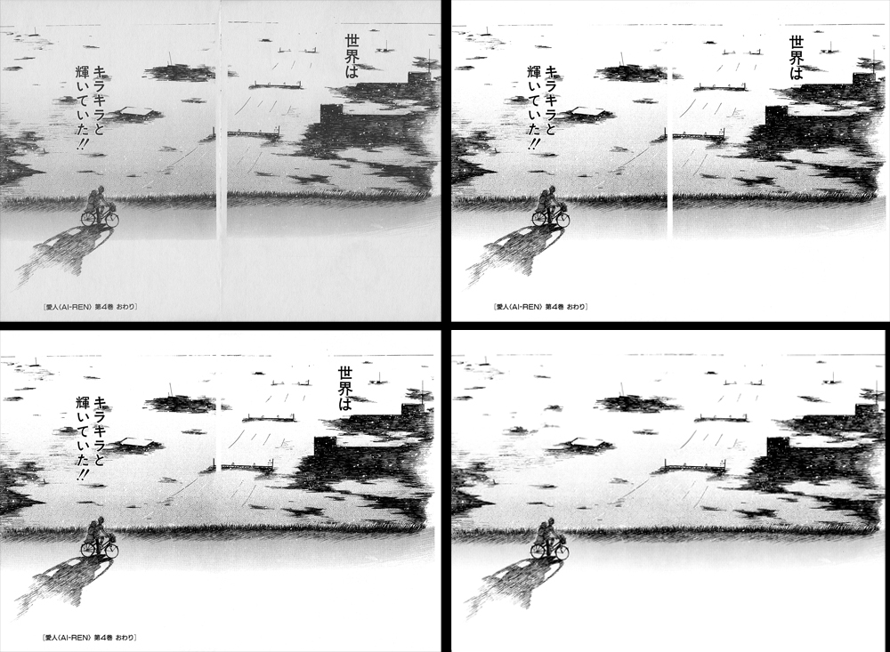
Joining a simple 2pg spread (I didn't have any more impressive ones on hand). Raw image shown top left. Image is leveled, then rotated and aligned (top right). Reconstruction begins, but note the slight darkness mismatch (bottom left). After reconstructing missing art and removing text, the border area is healed, and various regions burned and dodged as needed in an attempt to match tone (bottom right, could've been done better but I'm lazy). Also note that excess regions on the edges were cropped off, resulting in a slightly smaller image.
4.2) Title Pages
Title pages are basically normal pages, and for the most part, should be dealt with as such. The only possible complication is the tendency for them to have large obtrusive text on art. One nice way to remove big tedious text is to select the magic wand tool, new selection, 50 tolerance (change as needed), YES anti-aliased, YES contiguous, and NOT all layers, select the text, expand the selection by a pixel if necessary, delete. Then quickly run a highlight dodge or eraser over the remainder or more carefully use the eraser to remove grey leftovers. Then redraw as necessary.
Two title pages (top-left and bottom-left), and then the same pages after cleaning and redrawing.
One convenient part about title pages that offsets the tediousness of redrawing is that you have more freedom in selecting a font without breaking consistency. Playing around with different text effects like larger stroke, drop shadow, etc. as well as choosing a large, high character density font may help reduce how much you need to redraw. Some groups like to standardize title fonts however, which may feel more "official" than changing things around, but personally I find it less fun.
Never use wildwords for titles. If your group specifies using wildwords for titles, just say no.
4.3) Color Pages
Color pages are also similar to normal pages. However, some of the methods outlined don't quite work on color. Removing gutter shadow may often alter the color to something other than what you want. Instead, it may be necessary to clone stamp the entire region, or redraw with a brush. You can define brush color easily by pressing ALT then clicking on the picture - the brush will take on the color of the pixel you clicked. Here, the healing and smudge tool can also be very effective, as well as color and pattern fill. Smudge in particular allows you to blend colors along strips too narrow for healing to be used without adjacent color distortion. Gradients can also prove handy, using ALT-clicking to define gradient end colors, and magic wand to select the area to be filled (you may need to adjust scaling or define the gradient endpoints beyond the selected area). Remember to blur and sharpen as needed. Another complication is that, redrawn color pages may actually look cleaner than original art. This is because raw color scans tend to have noise around high contrast edges, as well as artifacts on solid areas. This aspect is probably not worth the effort to remedy, so just leave it be. Filters like despeckle can also help to reduce jpeg artifacts, but at the cost of sharpness. Also, poor scans or scans from glossy paper without appropriate adjustments may result in color banding, a sometimes difficult effect to mimic with reconstructed art.

Artifacts caused by poor jpg compression are clearly visible on the left. By applying the despeckle filter, much of the artifacts are removed, though at the cost of sharpness. Residual artifacts on the right are partially the result of re-compression for use in this guide, as well as artifacts that simply were not removed.
Also, remember, if the page is colored, you may need or want to change text color to match. A simple way is to select the brush, use ALT to define the color, then just switch to the text tool without changing this color; alternatively, you can just click the color designator, then select the point on your image (eyedropper should come up automatically).
A nice way to check if you’ve blended the tones properly is to just open the levels dialogue and adjust the middle arrow all the way to the right, and see if any glaring mistakes are seen (don’t commit this leveling change, of course). For extracting sections of art, it also can help to apply the stroke layer style to check for bits of dirt otherwise too small to notice.
4.4) Magazine Scans
I've started a section on touching up magazine scans here.
Editing from serializations can sometimes be annoying and tedious. Wayward specks are much more prevalent but still need to be removed, title pages often have large glaring advertisements, and solid regions often become a speckled grey. Depending on the page, precedence, and your personal ability, you may or may not be able to clean up ads on the title page. The problem that is most unique and noticeable for magazine scans is the dust and dandruff look that appears on what should be solid black regions (perhaps publishers trying to save ink).
The quick and easy way to fix this is to just take the burn tool on shadows (or midtones, but it takes more burning if set to midtones) and either a hard or soft brush, depending on if there is neighboring art that should not be burned, and burn the area until the specks are gone. Gaps in lineart that occur for similar reasons really can't be fixed without manual redrawing unless you resort to overleveling, but this has the added disadvantage of leaving you with jagged looking lines. If you do use the burn tool, be careful that you don't burn grays adjacent to areas you're trying to solidify. In some cases, it may be better to use either the polygonal lasso tool and black delete, or a black brush to directly color it in. Polygonal lasso is more suited to larger, irregular edge areas, whereas brush is a bit more efficient for smaller regions or spot cleaning. The same thing goes for the whites. Just use the dodge tool on highlights if you don't have surrounding areas to worry about. When you do, again, the polygonal lasso with white delete or the eraser tool will come in handy. Check the Fine Touches section for ways to check if you've cleaned off the specks.
4.5) Bleed
A common problem, especially with magazine scans, is having art bleed through in the scan from the page on the other side of the paper. Appropriate scanning techniques can minimize this, but sometimes paper quality is just too poor. Bleed through areas are generally most noticeable on broad grey regions or textures. Clone and heal appropriately to eliminate bleed. For thin bleed lines, sometimes an easy way can be to use a small brush (as thick as the bleed line) on dodge (usually bleed lines are darker than the surrounding texture) and run it over the bleed line; you may be able to completely get rid of some lines this way. Usually I only do this with bleed lines from frame edges, since they're straight lines that are often vertical or horizontal; you can shift-click (or hold shift and drag) back and forth for these lines, whereas trying to go back and forth over curves is a lot more work.

A somewhat typical magazine scan. As marked in the upper circle, art from the underlying page has bled through, and as marked in the lower circle, areas that should be solid black are dusty. These issues persist even after leveling, and must be manually cleaned.
4.6) Adjusting Translations
As an editor, even if scripts are proofread separately, you have the option to reword things as need be. There are various reasons as to why this may be desirable. If your script has a lot of "engrish," you can reword things for understanding and flow (assuming you have a good grasp of the English language). Sometimes, the literal translation doesn't match the style or character of speech (too formal sometimes, but try to minimize unfamiliar slang or intentional misspellings when making dialogue more casual). However, on top of that, you may reword text for more aesthetic reasons as well. Consider the size and dimensions of your text bubble, and choose appropriate diction to look and fit nicely.
Sometimes (very rarely) you may need to overhaul entire sentences and put different things in different bubbles to account for the difference in grammar and sentence structure. Also, for text on art, sometimes font choice and whatnot can only go so far, and you may want to reword some text to better cover up what you couldn't redraw sufficiently (a dumb reason perhaps, but if absolutely necessary, then by all means). Naturally, especially if you have a good proofreader, or unless you have some grasp of the native language in the raws, be cautious in how you reword things in order to avoid losing bits of meaning and information. Generally, try to keep aesthetic rewording to an absolute minimum.
4.7) Actions
Perhaps one of the handiest features of Photoshop is the actions presets. You can assign a hotkey to a series of actions, greatly reducing the amount of time you spend navigating menus and adjusting settings. Personally I use 3 presets - 3px white stroke, select background layer, and 100% zoom. You can pretty much assign an action to any sequence of commands, so whatever you find yourself doing very often and would like to do with 1 button, set it up. To use, open the Actions window (ALT+F9), click create new action, then simply click record, perform your action, and hit stop.
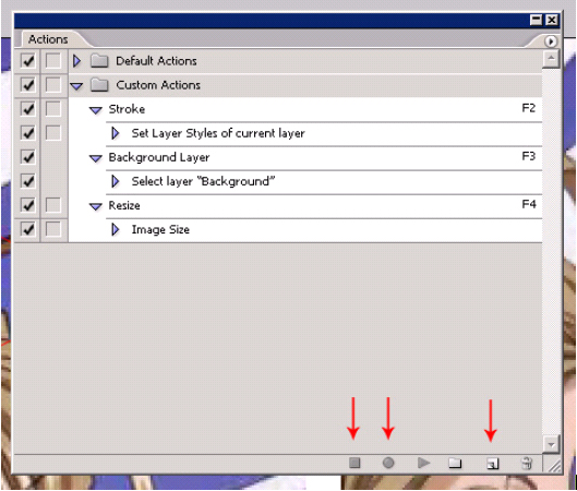
Actions I personally find helpful. Note (left to right) the stop, record, and new action buttons.
4.8) Wacom Tablets
These tablets are handy but expensive pieces of hardware (cheapest is I think $90) that, for those of us who are pretty good at drawing on paper but not so good with a mouse, gives you much better control, especially in drawing curves and whatnot. There’s also a plethora of features that Photoshop takes advantage of (pressure sensitivity for example). Unfortunately, I can’t comment much more on this little device as I’m currently too poor to own one, but from what I’ve heard from people with these tablets, they are worth it if you have the cash laying around (I wouldn’t buy one solely for manga editing, but if you plan on doing graphics design or whatnot it’d be pretty handy). Their website is at Wacom Technology (other manufacturers make tablets as well, though I’m not familiar with any or their relative quality). Still, because manga editing generally involves filling in areas and patters or connecting broken lines, the need for a more natural freehand pointer is not as great as it may seem, and for all but the largest of gaps, a tablet is probably only slightly if at all superior than a mouse.
4.9) StrokeIt
Totally optional, but I find extremely helpful, is a 3rd party program called StrokeIt (StrokeIt). It allows you to bind mouse gestures to various commands, including running programs, opening websites, copy/pasting, closing windows, and the like. In particular, you can set it to send keystrokes, which by itself (and combined with the actions dialogue) is extremely powerful. Since Photoshop generally doesn't use the right mouse button, StrokeIt is a great complement, as presets are executed by holding down the right mouse button and gesturing various letters/symbols/etc (single right mouse click functionality is preserved, and there really isn't anything in Photoshop that requires dragging right click). For example, if I hold right mouse and gesture a 'B,' Photoshop changes the active layer to the background (select background set to a function key, then mouse gesture set to that hotkey). Or, gesturing an 'L' opens the levels dialogue (set to send keystroke CTRL+L). Basically this helps in that you don't have to search for keyboard shortcuts and can just leave your left hand on ‘asdf’ and your right hand on the mouse. These examples might seem silly, saving only a few seconds each time they're used, but ultimately it does make a noticeable difference, and more complex commands can be programmed as well.
4.10) NeatImage
Another handy program, though not free, is NeatImage Pro, a noise reduction program (official site Neat Image). It can work either as standalone or as a filter in Photoshop. More precise instructions for its use are listed at its official site, but a few extra pointers - if autoprofile doesn't work, you may need to manually select a region to profile, one that may be smaller than the desired 100x100 (there are 3 modes: too small where it cannot profile, smaller than desired but still useable, and good). Also, for profiling, try to avoid signal clipping of any kind, but if it's not a problem when you preview it, then it's not a problem. Avoid lineart in the profile region, since this will result in your lineart becoming sections of grey and black rather than solid black lines. Also be careful of white wedges into dark areas or surrounded by thick black lines, as corners may be rounded off with grays.
It's often helpful to re-level the page after applying this filter, and try to check that you've releveled the white enough by momentarily adjusting the middle arrow as far to the right as possible (to the rightmost arrow) to check for grey halos around lineart (bring the middle arrow back to 1.00 of course, before committing any leveling changes).

A raw image after basic leveling (left) compared to the same image after with the filter applied and post-filter leveling (right). Note how the textures especially are much softer and smoother. Some bleed is still apparent, and would normally be corrected prior to applying the filter.
In addition to giving your page a softer look, this filter can also help minimize clone artifacts if you didn't match up textures perfectly, and also remove faint specks that you may not have noticed and erased. However, try to avoid making your page look too plastic-like by overusing this filter.
Index
Cleaning Scans
Typesetting
Saving Files
Advanced Stuff