STEP 1: WHITE-OUT
 |
- Click Layer 1.
* Most of my cleaning work are on done on Layer 1.
- Click the Rectangle Tool [U] with the settings that I provided before.
- Cover all the text appearing on a white background.
- Use the Brush Tool [B] with foreground color set to white and a suitable brush size to reach any places the Rectangle Tool couldn't.
Should look something like THIS
|
STEP 2: CLONE/PATCH
 |
THE CLONE TOOL
- Click the Clone Tool [S].
- Choose a situable brush size and uncheck Aligned.
- Click Background Layer
- Hold Alt and click the grainy pattern where there is no text in it.
- Go back to Layer 1.
* Again, I like to work on Layer 1 so that I can go back and see where the original text was positioned and erase things (if necessary) more easier.
- Start brushing over the Non-english text. :)
|

 |
THE PATCH TOOL
- Click the Patch Tool [J].
- Select the radio button Destination.
- Click Background Layer
- Like using a pencil, draw a shape larger than the text in the grainy pattern area. Be careful not to select any of the text area or anything else besides the grainy pattern.
When you release the mouse, the shape will become a selection.
- Place your mouse inside the selection, a black arrow will appear. Then drag that selection over to the text area and tadaa! All the text is gone. :)
- Repeat for the other box.
*NOTE This has to be done on the layer that contains the pattern which is the Background Layer.
I used the same cloning and patching technique for all the other text.
|
STEP 3: RE-DRAWING

|
* This is how to fix broken lines.
- Work on a New Layer [SHIFT+CTRL+N].
* Just in case you need to erase something.
- Click the Brush Tool [B] and choose size 1
- Click the Pen Tool [P]
Have the settings at the top bar set to Paths and check Rubber band (click the down arrow next to the weird shape thing), and Exclude overlapping path areas.

|

|
- Click one point.
- Click a second point withought releasing the mouse.
- Still holding the mouse, drag down to curve the line until the line is good enough.
|

|
- Right-Click >> Stroke Path
|

|
- Tool: Brush >> OK
|

|
- Line is completed. ^__^ Since this line is on a separated layer you can erase off any parts that's sticking out.
- Merge with Layer 1 [CTRL+E].
For more information about the pen tool go to my Digital Inking Tutorial
|
This is what the final cleaned-up scan looks like >FINAL CLEAN UP<
STEP 4: TEXT
 |
Have your Character Palette open when you are editing. It will be very useful and more convienent.
- Text Units: Pixels
- Anit-Aliasing: Smooth
- Leading, Kerning, Tracking, Baseline Shift: 0
- Vertically Scale & Horizontally Scale: 100%
- Color: Black (#000000) for talk and Gray (#666666) for thoughts/narration.
- Align: Most of the times Center
* Font size will vary depending on bubble/box size and amount of text in a bubble/box etc...
* Side fonts are about usually smaller than the regular ones.
|
 |
Have your Character Palette open when you are editing. It will be very useful and more convienent.
- Make sure you are working in Set 1 so that every time you enter a dialogue, that text layer will automatically go in Set 1. If it's outside Set 1, then just drag the layer and put it into Set 1 and continue from there.
Again, you don't have to do this. :/ I just find it more easier to browse.
|
 |
Have your Character Palette open when you are editing. It will be very useful and more convienent.
- Click the Text Tool.
* You can set the setting before or after. Up to you. I like to do it before.
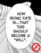
- Make a box using the Type Tool.
(Click, hold the mouse, drag down and release)
- Copy and paste the character's line into the box.
* Not a very good idea to type it. -_-U
- Font used here is Wild Words Roman.
|
 |
- Font: Felt
- Size: 18 px
- Color: #666666
- Align: Center
- Stoke: White, 3 pixels
Right-Click the Layer >> Blending Options >> Stroke >> 3 Pixels >> White

- On the layer with the stroke Right-Click >> Copy Layer Style and use it for later by Right-Click >> Paste Layer Style. That way you don't have to keep going to the Blending options.
|
Somethings to keep in mind:
- Keep your text neat and appealing to the eyes as well.
1.  2.
2.  3.
3. 
|
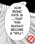
1. Top half of text is not even with bottom half of text and it's also unappealing. :/
2. Too long. Looks bad.
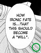
3. Good. :)
|
STEP 5: SFX
 |
 |
 |
 |
SfX: Thump
* All SFX layers will go into Set 2. ^_^
|
Cleaned-up using Brush, Clone, and Pen Tool
I already did this in Step. 2 :) But you can save it for last if you want.
|
Font: Cafe Pop
Color: White
Stroke: Black, 3 Pixels
Siana's Tip: "Try to find fonts that resemble the japanese...keep it easy to read."
|
This is when you can play with the other options in the Character Palette such as Kerning, Leading, Vertically Scale, Horizontally Scale, etc...
Here, I Vertically Scale it 150%.
|
FINAL EDITED SCAN
>>> REVIEW
|